

Your graphics add a nice touch to my presentations and I recently used them for one of my all-hands meetings. Your toolbox adds professionalism to my slides. Instead of using standard clipart.
Claude Jones, Director of Engineer, @Walmartlabs, USA

Your graphics add a nice touch to my presentations and I recently used them for one of my all-hands meetings. Your toolbox adds professionalism to my slides. Instead of using standard clipart.
Claude Jones, Director of Engineer, @Walmartlabs, USA
I needed a fresh look at some of my slides. I've tried to find a way to create a paintbrush effect, to underline, accentuate, add some color and the handwritten markers were just the things. Very easy to use, easy to size, change the color. It was an affordable, perfect solution and I'm happy to recommend it.
Anonymous, US
The crisp, clean look of the graphics, and the fact that it allowed me to easily edit and change the colors to match the template was my main reason for purchasing them.
Brandie Jenkins, E-learning Developer, USA
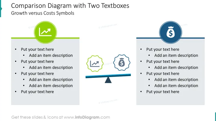
La diapositiva se titula "Diagrama de Comparación con Dos Cuadros de Texto," lo que sugiere una herramienta para yuxtaponer dos elementos diferentes, en este caso, "Símbolos de Crecimiento versus Costos." Cada lado de la comparación tiene un cuadro de texto coloreado con texto de marcador de posición ("Pon tu texto aquí" y "Agrega una descripción del artículo"), representando puntos para expandir el concepto que simboliza. El lado izquierdo está vinculado al crecimiento, indicado por una flecha hacia arriba en un círculo verde, sugiriendo tendencias positivas o aumento financiero. Por el contrario, el lado derecho representa costos, con un signo de dólar encapsulado en un círculo azul, denotando gastos o inversiones financieras.
La diapositiva emplea un diseño limpio y moderno con una clara distinción visual entre las dos categorías comparadas. Su diseño simétrico y colores contrastantes ayudan a transmitir un claro mensaje comparativo.



