Your graphics add a nice touch to my presentations and I recently used them for one of my all-hands meetings. Your toolbox adds professionalism to my slides. Instead of using standard clipart.
Claude Jones, Director of Engineer, @Walmartlabs, USA
Your graphics add a nice touch to my presentations and I recently used them for one of my all-hands meetings. Your toolbox adds professionalism to my slides. Instead of using standard clipart.
Claude Jones, Director of Engineer, @Walmartlabs, USA
I needed a fresh look at some of my slides. I've tried to find a way to create a paintbrush effect, to underline, accentuate, add some color and the handwritten markers were just the things. Very easy to use, easy to size, change the color. It was an affordable, perfect solution and I'm happy to recommend it.
Anonymous, US
The crisp, clean look of the graphics, and the fact that it allowed me to easily edit and change the colors to match the template was my main reason for purchasing them.
Brandie Jenkins, E-learning Developer, USA
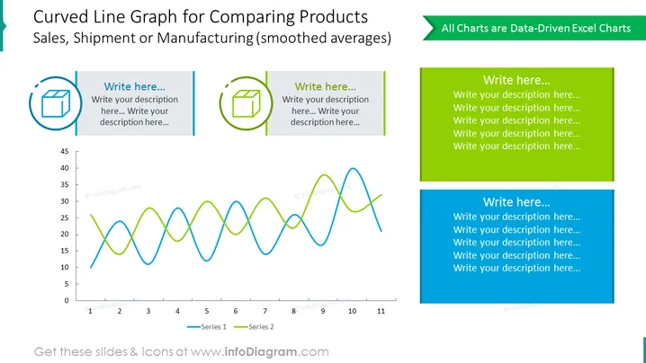
Diapositiva de comparación colorida que contiene el gráfico de línea curva que ilustra las estadísticas de producción del producto como fabricación, envío o ventas en un diagrama. Todos los elementos del diagrama están impulsados por datos de Excel y son totalmente editables. Además del gráfico, puedes utilizar los contenedores de descripción en el lado.
Esta Comparación de Diapositivas de Productos Ilustrada Con Diagrama de Gráfico de Línea Curva es parte de nuestra Plantilla de PPT de Gráficos Impulsados por Datos de Gráfico de Líneas.


