Your graphics add a nice touch to my presentations and I recently used them for one of my all-hands meetings. Your toolbox adds professionalism to my slides. Instead of using standard clipart.
Claude Jones, Director of Engineer, @Walmartlabs, USA
Your graphics add a nice touch to my presentations and I recently used them for one of my all-hands meetings. Your toolbox adds professionalism to my slides. Instead of using standard clipart.
Claude Jones, Director of Engineer, @Walmartlabs, USA
I needed a fresh look at some of my slides. I've tried to find a way to create a paintbrush effect, to underline, accentuate, add some color and the handwritten markers were just the things. Very easy to use, easy to size, change the color. It was an affordable, perfect solution and I'm happy to recommend it.
Anonymous, US
The crisp, clean look of the graphics, and the fact that it allowed me to easily edit and change the colors to match the template was my main reason for purchasing them.
Brandie Jenkins, E-learning Developer, USA
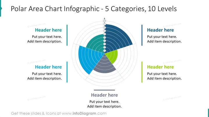
Esta diapositiva es un excelente ejemplo de un gráfico de área polar, que es un gráfico circular que se puede utilizar para comparar las proporciones de diferentes categorías. Los datos se agrupan en diferentes segmentos que están dispuestos alrededor del círculo, con los segmentos más grandes apareciendo con las partes de color más intenso. El tamaño de los segmentos coloreados está determinado por su valor relativo, siendo los segmentos más coloridos los que representan los valores más altos. Este gráfico es útil para visualizar proporciones relativas y se puede utilizar para comparar diferentes conjuntos de datos relativamente simples.
Esta diapositiva del Diagrama de Ventilador de Demografía del Consumidor es parte de nuestra Plantilla de PowerPoint de Gráfico de Ventilador Radial.


