

Your graphics add a nice touch to my presentations and I recently used them for one of my all-hands meetings. Your toolbox adds professionalism to my slides. Instead of using standard clipart.
Claude Jones, Director of Engineer, @Walmartlabs, USA

Your graphics add a nice touch to my presentations and I recently used them for one of my all-hands meetings. Your toolbox adds professionalism to my slides. Instead of using standard clipart.
Claude Jones, Director of Engineer, @Walmartlabs, USA
I needed a fresh look at some of my slides. I've tried to find a way to create a paintbrush effect, to underline, accentuate, add some color and the handwritten markers were just the things. Very easy to use, easy to size, change the color. It was an affordable, perfect solution and I'm happy to recommend it.
Anonymous, US
The crisp, clean look of the graphics, and the fact that it allowed me to easily edit and change the colors to match the template was my main reason for purchasing them.
Brandie Jenkins, E-learning Developer, USA
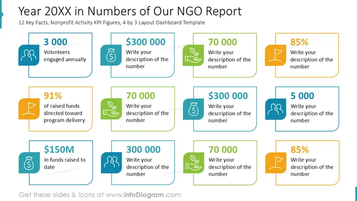
La diapositiva muestra indicadores clave de rendimiento (KPI) para el informe anual de una ONG. Destaca varios logros como "3,000 Voluntarios comprometidos anualmente", reflejando la participación comunitaria. "El 91% de los fondos recaudados dirigidos a la entrega de programas" muestra una asignación efectiva de recursos. La mención de "$150M en fondos recaudados hasta la fecha" demuestra un logro financiero. Las cifras "70,000" y "$300,000" indican métricas cuantitativas específicas importantes para el rendimiento de la ONG.
En general, la diapositiva emplea un diseño estructurado y visualmente atractivo, utilizando iconografía y diferenciación de colores para enfatizar eficazmente los puntos de datos clave.



