Your graphics add a nice touch to my presentations and I recently used them for one of my all-hands meetings. Your toolbox adds professionalism to my slides. Instead of using standard clipart.
Claude Jones, Director of Engineer, @Walmartlabs, USA
Your graphics add a nice touch to my presentations and I recently used them for one of my all-hands meetings. Your toolbox adds professionalism to my slides. Instead of using standard clipart.
Claude Jones, Director of Engineer, @Walmartlabs, USA
I needed a fresh look at some of my slides. I've tried to find a way to create a paintbrush effect, to underline, accentuate, add some color and the handwritten markers were just the things. Very easy to use, easy to size, change the color. It was an affordable, perfect solution and I'm happy to recommend it.
Anonymous, US
The crisp, clean look of the graphics, and the fact that it allowed me to easily edit and change the colors to match the template was my main reason for purchasing them.
Brandie Jenkins, E-learning Developer, USA
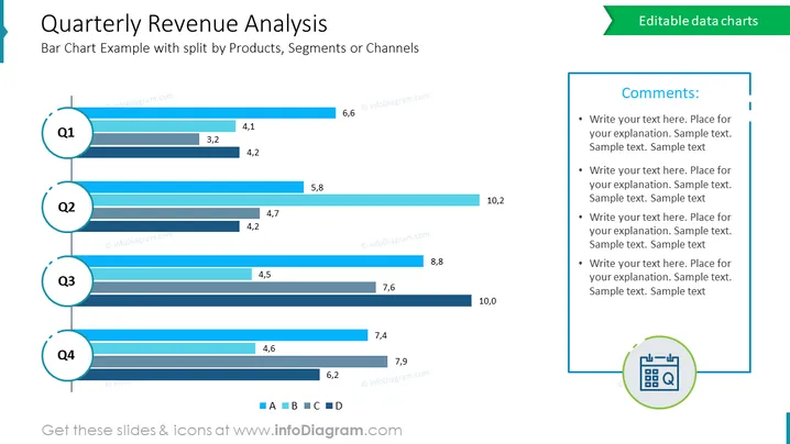
La diapositiva es una representación visual del análisis de ingresos trimestrales de una empresa, mostrando desgloses de ventas por diferentes segmentos o canales a lo largo de cuatro trimestres. El gráfico de barras compara el desempeño de cuatro categorías, etiquetadas como A, B, C y D, para cada trimestre, indicando ingresos en miles de millones. El diseño permite una rápida comparación entre los segmentos e identifica qué categorías están teniendo un mejor desempeño o necesitan mejora.
Esta diapositiva podría ser utilizada en varios tipos de presentaciones empresariales, incluyendo:


