Your graphics add a nice touch to my presentations and I recently used them for one of my all-hands meetings. Your toolbox adds professionalism to my slides. Instead of using standard clipart.
Claude Jones, Director of Engineer, @Walmartlabs, USA
Your graphics add a nice touch to my presentations and I recently used them for one of my all-hands meetings. Your toolbox adds professionalism to my slides. Instead of using standard clipart.
Claude Jones, Director of Engineer, @Walmartlabs, USA
I needed a fresh look at some of my slides. I've tried to find a way to create a paintbrush effect, to underline, accentuate, add some color and the handwritten markers were just the things. Very easy to use, easy to size, change the color. It was an affordable, perfect solution and I'm happy to recommend it.
Anonymous, US
The crisp, clean look of the graphics, and the fact that it allowed me to easily edit and change the colors to match the template was my main reason for purchasing them.
Brandie Jenkins, E-learning Developer, USA
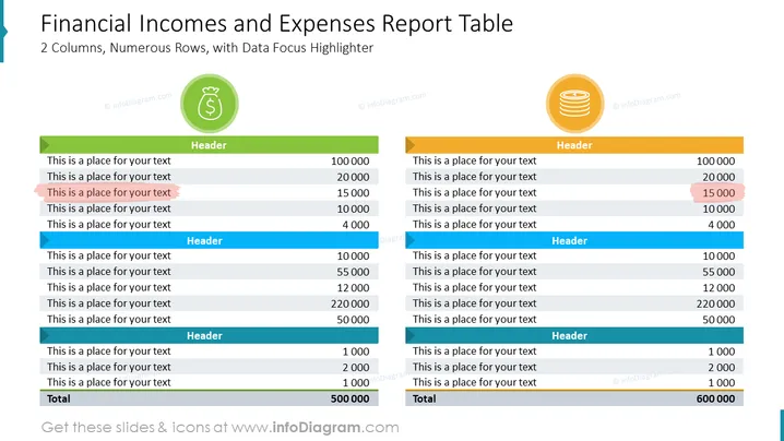
Die PowerPoint-Folie mit dem Titel "Berichtstabelle zu finanziellen Einkünften und Ausgaben" zeigt eine Tabelle, die finanzielle Einkünfte und Ausgaben vergleicht, mit einem Fokus auf Datenvisualisierung durch 2 Spalten und zahlreiche Zeilen. Jede Spalte hat eine einzigartige Farbe, um zwischen den beiden Kategorien zu unterscheiden: Einkünfte sind mit Grün und Ausgaben mit Gold verbunden. Unten gibt es eine Gesamtliste, die die Summierung der aufgelisteten finanziellen Beträge anzeigt. Hervorgehobene Zeilen lenken die Aufmerksamkeit auf spezifische wichtige Punkte und weisen auf eine Datenfokussierung hin.
Die visuelle Komposition der Folie zielt auf Klarheit und Lesbarkeit ab, mit auffälligem Einsatz von Farbkennzeichnungen und Icons, um zwischen Einkommens- und Ausgabekategorien zu unterscheiden. Die fetten Farbhervorhebungen innerhalb der Tabellen dienen dazu, die Aufmerksamkeit auf bestimmte Zeilen zu lenken, die signifikante Beträge anzeigen.


