Your graphics add a nice touch to my presentations and I recently used them for one of my all-hands meetings. Your toolbox adds professionalism to my slides. Instead of using standard clipart.
Claude Jones, Director of Engineer, @Walmartlabs, USA
Your graphics add a nice touch to my presentations and I recently used them for one of my all-hands meetings. Your toolbox adds professionalism to my slides. Instead of using standard clipart.
Claude Jones, Director of Engineer, @Walmartlabs, USA
I needed a fresh look at some of my slides. I've tried to find a way to create a paintbrush effect, to underline, accentuate, add some color and the handwritten markers were just the things. Very easy to use, easy to size, change the color. It was an affordable, perfect solution and I'm happy to recommend it.
Anonymous, US
The crisp, clean look of the graphics, and the fact that it allowed me to easily edit and change the colors to match the template was my main reason for purchasing them.
Brandie Jenkins, E-learning Developer, USA
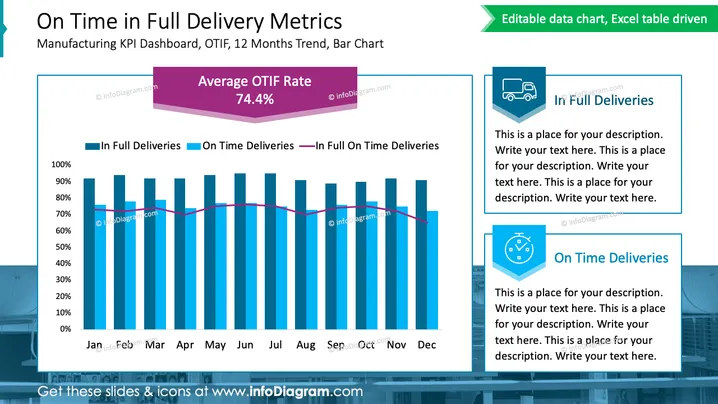
Diese PowerPoint-Folie mit dem Titel "On-Time-In-Volle-Liefer-Metriken" präsentiert ein KPI-Dashboard zur Verfolgung von OTIF (On Time in Full) über einen 12-monatigen Trend mit einem Balkendiagramm. Sie enthält drei wichtige Datenpunkte: "Vollständige Lieferungen", "Pünktliche Lieferungen" und "Vollständige pünktliche Lieferungen." "Vollständige Lieferungen" bezieht sich auf Bestellungen, die mit allen angeforderten Artikeln geliefert werden. "Pünktliche Lieferungen" stellt Bestellungen dar, die bis zum vereinbarten Datum geliefert werden. "Vollständige pünktliche Lieferungen" kombiniert beide Aspekte und bezeichnet Bestellungen, die vollständig und termingerecht sind. Die Folie berichtet auch von einer "Durchschnittlichen OTIF-Rate" von 74,4%.
Die Folie ist professionell und sauber gestaltet und legt den Fokus auf die Klarheit der Datenpräsentation. Der Einsatz von Farben unterscheidet verschiedene Metriken, und Icons werden verwendet, um die Lieferkonzepte visuell darzustellen.


