Your graphics add a nice touch to my presentations and I recently used them for one of my all-hands meetings. Your toolbox adds professionalism to my slides. Instead of using standard clipart.
Claude Jones, Director of Engineer, @Walmartlabs, USA
Your graphics add a nice touch to my presentations and I recently used them for one of my all-hands meetings. Your toolbox adds professionalism to my slides. Instead of using standard clipart.
Claude Jones, Director of Engineer, @Walmartlabs, USA
I needed a fresh look at some of my slides. I've tried to find a way to create a paintbrush effect, to underline, accentuate, add some color and the handwritten markers were just the things. Very easy to use, easy to size, change the color. It was an affordable, perfect solution and I'm happy to recommend it.
Anonymous, US
The crisp, clean look of the graphics, and the fact that it allowed me to easily edit and change the colors to match the template was my main reason for purchasing them.
Brandie Jenkins, E-learning Developer, USA
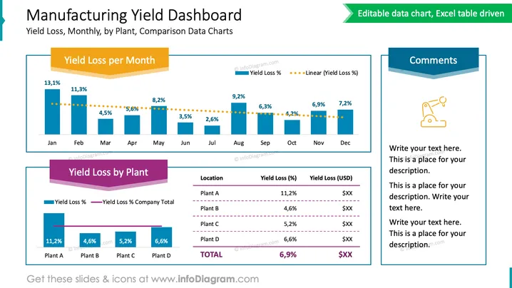
Diese PowerPoint-Folie mit dem Titel "Herstellungsausbeute-Dashboard" präsentiert einen Vergleich der Ausbeutekosten über verschiedene Zeiträume und Standorte. Das erste Diagramm, "Monatlicher Ertragsverlust", veranschaulicht den prozentualen Ertragsverlust für jeden Monat, wobei die Prozentsätze im Laufe des Jahres abnehmen. Der abnehmende Trend wird durch eine gepunktete Linie betont, die einen linearen Trend der Ertragsverlustprozentsätze darstellt. Das zweite Diagramm, "Ertragsverlust nach Werk", vergleicht die Ertragsverlustprozentsätze und Dollarwerte an vier verschiedenen Standortanlagen und hebt die Unterschiede in der Leistung hervor. Ein Seitenfeld mit dem Titel "Kommentare" bietet Platz für zusätzliche Anmerkungen, die zur Erklärung der Daten oder zur Vorschlag von umsetzbaren Einsichten verwendet werden können.


