Your graphics add a nice touch to my presentations and I recently used them for one of my all-hands meetings. Your toolbox adds professionalism to my slides. Instead of using standard clipart.
Claude Jones, Director of Engineer, @Walmartlabs, USA
Your graphics add a nice touch to my presentations and I recently used them for one of my all-hands meetings. Your toolbox adds professionalism to my slides. Instead of using standard clipart.
Claude Jones, Director of Engineer, @Walmartlabs, USA
I needed a fresh look at some of my slides. I've tried to find a way to create a paintbrush effect, to underline, accentuate, add some color and the handwritten markers were just the things. Very easy to use, easy to size, change the color. It was an affordable, perfect solution and I'm happy to recommend it.
Anonymous, US
The crisp, clean look of the graphics, and the fact that it allowed me to easily edit and change the colors to match the template was my main reason for purchasing them.
Brandie Jenkins, E-learning Developer, USA
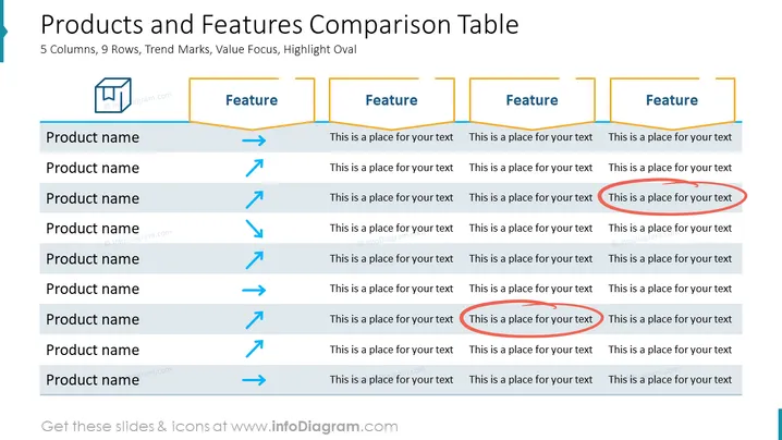
Die Folie ist als Matrix strukturiert, um mehrere Produkte hinsichtlich verschiedener Merkmale zu vergleichen. Sie besteht aus Zeilen für jedes Produkt und Spalten für jedes Merkmal. Trendmarkierungen wie Pfeile und Linien erscheinen neben den Produktnamen, um die Leistung oder Trends für dieses Element anzuzeigen, wie zunehmende, abnehmende oder stabile Trends. Jeder Abschnitt des Merkmals hat Platzhaltertext, der vorschlägt, wo beschrieben werden kann, wie jedes Produkt zum Merkmal in Beziehung steht, und lädt zu einer detaillierten Vergleichsanalyse ein.
Das Gesamtbild der Folie ist sauber und korporativ, verwendet Farbkennzeichnungen und visuelle Hilfsmittel wie Pfeile und Linien, um Trends und Hierarchien auf einen Blick zu vermitteln. Das Layout ist gitterbasiert, was es einfach macht, den Vergleich zwischen verschiedenen Produkten und Merkmalen nachzuvollziehen und zu verstehen.


