Your graphics add a nice touch to my presentations and I recently used them for one of my all-hands meetings. Your toolbox adds professionalism to my slides. Instead of using standard clipart.
Claude Jones, Director of Engineer, @Walmartlabs, USA
Your graphics add a nice touch to my presentations and I recently used them for one of my all-hands meetings. Your toolbox adds professionalism to my slides. Instead of using standard clipart.
Claude Jones, Director of Engineer, @Walmartlabs, USA
I needed a fresh look at some of my slides. I've tried to find a way to create a paintbrush effect, to underline, accentuate, add some color and the handwritten markers were just the things. Very easy to use, easy to size, change the color. It was an affordable, perfect solution and I'm happy to recommend it.
Anonymous, US
The crisp, clean look of the graphics, and the fact that it allowed me to easily edit and change the colors to match the template was my main reason for purchasing them.
Brandie Jenkins, E-learning Developer, USA
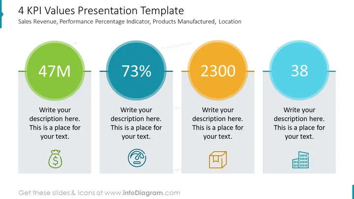
Die Folie mit dem Titel "4 KPI-Werte Präsentationsvorlage" zeigt vier verschiedene KPI (Key Performance Indicators), die für die Geschäftsanalyse relevant sind: Umsatz, Leistungsprozentsatz, produzierte Produkte und Standorte. Jeder KPI wird durch einen großen farbigen Kreis dargestellt, der eine Schlüsselzahl enthält: "47M" und ein Geldbeutel-Icon, das den Umsatz symbolisiert, "73%" mit einem kreisförmigen Fortschrittsbalken-Icon, das auf die Leistungsbewertung hinweist, "2300" begleitet von einem Kasten-Icon, das wahrscheinlich die Anzahl der produzierten Produkte darstellt, und "38" neben einem Gebäude-Icon, das möglicherweise die Anzahl der Standorte angibt.
Die Folie hat ein sauberes und professionelles Design mit kontrastierenden, farbenfrohen Kreisen, die die Schlüsselzahlen ins Auge fallen lassen. Die Icons sind einfach und kommunizieren das Wesentliche jedes KPI intuitiv.


