

Your graphics add a nice touch to my presentations and I recently used them for one of my all-hands meetings. Your toolbox adds professionalism to my slides. Instead of using standard clipart.
Claude Jones, Director of Engineer, @Walmartlabs, USA

Your graphics add a nice touch to my presentations and I recently used them for one of my all-hands meetings. Your toolbox adds professionalism to my slides. Instead of using standard clipart.
Claude Jones, Director of Engineer, @Walmartlabs, USA
I needed a fresh look at some of my slides. I've tried to find a way to create a paintbrush effect, to underline, accentuate, add some color and the handwritten markers were just the things. Very easy to use, easy to size, change the color. It was an affordable, perfect solution and I'm happy to recommend it.
Anonymous, US
The crisp, clean look of the graphics, and the fact that it allowed me to easily edit and change the colors to match the template was my main reason for purchasing them.
Brandie Jenkins, E-learning Developer, USA
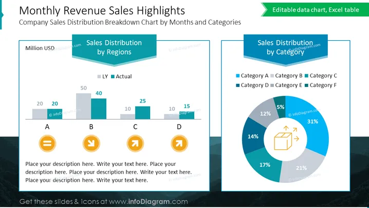
Die Folie stellt einen Vergleich der Umsatzverteilungen des Unternehmens basierend auf Regionen und Kategorien über einen Monat dar. Die linke Seite der Folie trägt den Titel "Umsatzverteilung nach Regionen" und zeigt ein Balkendiagramm, das den Umsatz von "Vorjahr" (VJ) mit dem "Tatsächlichen" Umsatz in vier als A, B, C und D gekennzeichneten Regionen vergleicht und anzeigt, dass Region B die höchsten Verkäufe hat. Die rechte Seite trägt den Titel "Umsatzverteilung nach Kategorien" und zeigt ein Kreisdiagramm mit sechs verschiedenen Kategorien, wobei Kategorie A als größtes Segment mit 31% dargestellt wird.
Das Gesamtbild der Folie ist professionell und klar, mit einem modernen Farbschema und 3D-Effekten, die Tiefe verleihen. Die Verwendung von Symbolen fügt eine visuelle Interpretation der dargestellten Daten hinzu.



