

Your graphics add a nice touch to my presentations and I recently used them for one of my all-hands meetings. Your toolbox adds professionalism to my slides. Instead of using standard clipart.
Claude Jones, Director of Engineer, @Walmartlabs, USA

Your graphics add a nice touch to my presentations and I recently used them for one of my all-hands meetings. Your toolbox adds professionalism to my slides. Instead of using standard clipart.
Claude Jones, Director of Engineer, @Walmartlabs, USA
I needed a fresh look at some of my slides. I've tried to find a way to create a paintbrush effect, to underline, accentuate, add some color and the handwritten markers were just the things. Very easy to use, easy to size, change the color. It was an affordable, perfect solution and I'm happy to recommend it.
Anonymous, US
The crisp, clean look of the graphics, and the fact that it allowed me to easily edit and change the colors to match the template was my main reason for purchasing them.
Brandie Jenkins, E-learning Developer, USA
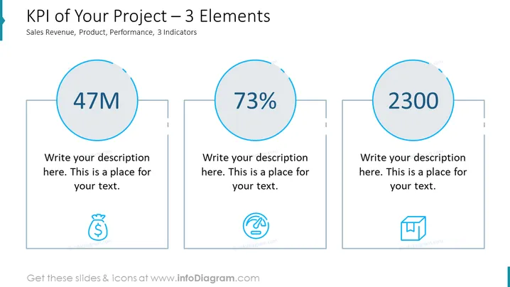
Die Folie präsentiert drei Key Performance Indicators (KPIs), die mit einem Projekt verbunden sind und nach Verkaufsumsatz, Produkt und Leistung kategorisiert sind. Jeder Indikator hat eine große zentrale Zahl – "47M", "73%" und "2300", die vermutlich einen Geldwert, einen Prozentsatz und eine Zählung oder Punktzahl darstellen. Unter jeder Zahl gibt es einen Platzhalter für eine Beschreibung, was impliziert, dass mehr Details hinzugefügt werden sollten, um diese Zahlen zu kontextualisieren. Begleitende Symbole deuten auf die Art jedes KPI hin: ein Geldsack für Verkaufsumsatz, ein Finger, der über eine digitale Oberfläche wischt, für Produkt und eine Box für Leistung.
Die Folie hat ein sauberes und minimalistisches Design mit viel Leerraum um die Elemente, was eine übersichtliche visuelle Erfahrung schafft. Die Verwendung von Symbolen hilft dabei, die dargestellten KPIs schnell zu verstehen.



