

Your graphics add a nice touch to my presentations and I recently used them for one of my all-hands meetings. Your toolbox adds professionalism to my slides. Instead of using standard clipart.
Claude Jones, Director of Engineer, @Walmartlabs, USA

Your graphics add a nice touch to my presentations and I recently used them for one of my all-hands meetings. Your toolbox adds professionalism to my slides. Instead of using standard clipart.
Claude Jones, Director of Engineer, @Walmartlabs, USA
I needed a fresh look at some of my slides. I've tried to find a way to create a paintbrush effect, to underline, accentuate, add some color and the handwritten markers were just the things. Very easy to use, easy to size, change the color. It was an affordable, perfect solution and I'm happy to recommend it.
Anonymous, US
The crisp, clean look of the graphics, and the fact that it allowed me to easily edit and change the colors to match the template was my main reason for purchasing them.
Brandie Jenkins, E-learning Developer, USA
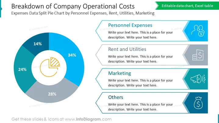
Die PowerPoint-Folie präsentiert eine visuelle "Aufschlüsselung der Betriebskosten des Unternehmens" mit einem segmentierten Kreisdiagramm und angrenzenden beschrifteten Kästen, die jede Kategorie erklären. Das Kreisdiagramm zeigt vier Ausgabenkategorien: Personalkosten (34 %), Miete und Nebenkosten (28 %), Marketing (24 %) und Sonstiges (14 %). Jeder Abschnitt entspricht einem anderen Aspekt der Betriebskosten - Personalkosten repräsentieren Gehälter und Sozialleistungen, Miete und Nebenkosten decken Grundstückskosten und wesentliche Dienstleistungen ab, Marketing umfasst Werbung und Promotion-Aktivitäten, und Sonstiges beinhaltet verschiedene Ausgaben, die nicht anderswo kategorisiert sind.



