Your graphics add a nice touch to my presentations and I recently used them for one of my all-hands meetings. Your toolbox adds professionalism to my slides. Instead of using standard clipart.
Claude Jones, Director of Engineer, @Walmartlabs, USA
Your graphics add a nice touch to my presentations and I recently used them for one of my all-hands meetings. Your toolbox adds professionalism to my slides. Instead of using standard clipart.
Claude Jones, Director of Engineer, @Walmartlabs, USA
I needed a fresh look at some of my slides. I've tried to find a way to create a paintbrush effect, to underline, accentuate, add some color and the handwritten markers were just the things. Very easy to use, easy to size, change the color. It was an affordable, perfect solution and I'm happy to recommend it.
Anonymous, US
The crisp, clean look of the graphics, and the fact that it allowed me to easily edit and change the colors to match the template was my main reason for purchasing them.
Brandie Jenkins, E-learning Developer, USA
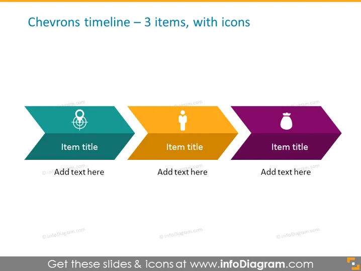
Die Folie präsentiert eine einfache Zeitleiste in Form von Chevron-Symbolen, die drei verschiedene Phasen oder Ereignisse in unterschiedlichen Farben anzeigt: Teal, Orange und Lila. Jeder Chevron enthält ein Symbol und Platzhalter für einen Titel des Elements und zusätzlichen Text. Der linke Chevron zeigt ein Globus-Symbol, das auf einen globalen oder internationalen Aspekt hinweist. Der zentrale Chevron zeigt ein Benutzer- oder Personensymbol, das eine benutzerorientierte oder demografische Phase darstellen könnte. Der rechte Chevron zeigt ein Sprühflaschen-Symbol, das möglicherweise auf eine Reinigungs- oder Wartungsphase hinweist.
Die Folie hat ein modernes und minimalistisches Design, das klare Linien und eine klare Struktur verwendet. Der Kontrast zwischen den bunten Chevrons und dem weißen Text und den Symbolen macht die Folie leicht lesbar und visuell ansprechend.


