Your graphics add a nice touch to my presentations and I recently used them for one of my all-hands meetings. Your toolbox adds professionalism to my slides. Instead of using standard clipart.
Claude Jones, Director of Engineer, @Walmartlabs, USA
Your graphics add a nice touch to my presentations and I recently used them for one of my all-hands meetings. Your toolbox adds professionalism to my slides. Instead of using standard clipart.
Claude Jones, Director of Engineer, @Walmartlabs, USA
I needed a fresh look at some of my slides. I've tried to find a way to create a paintbrush effect, to underline, accentuate, add some color and the handwritten markers were just the things. Very easy to use, easy to size, change the color. It was an affordable, perfect solution and I'm happy to recommend it.
Anonymous, US
The crisp, clean look of the graphics, and the fact that it allowed me to easily edit and change the colors to match the template was my main reason for purchasing them.
Brandie Jenkins, E-learning Developer, USA
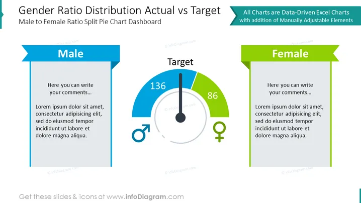
Die PowerPoint-Folie mit dem Titel „Geschlechterverhältnis Verteilung Aktuell vs Ziel“ präsentiert Daten zu Geschlechterverhältnissen mithilfe eines aufgeteilten Tortendiagramm-Dashboards. Die Folie ist in drei Abschnitte unterteilt: „Männlich“, „Ziel“ und „Weiblich“. Jeder Abschnitt hat Platz für Kommentare und begleitenden Lorem-Ipsum-Platzhaltertext. Die Abschnitte „Männlich“ und „Weiblich“ bieten Raum für Kommentare, während der Abschnitt „Ziel“ ein Messdiagramm mit Zahlenwerten anzeigt, die die aktuellen (136) und Ziel (86) Geschlechterverhältnisse darstellen, jeweils dargestellt durch die blauen und grünen Abschnitte.
Die Folie hat ein ausgewogenes Layout mit visuellen Elementen, die das Konzept der Messung der tatsächlichen Leistung im Vergleich zu festgelegten Zielen verständlich machen. Symbole und Farbcodierung werden effektiv eingesetzt, um zwischen den Geschlechtern zu unterscheiden.


