Your graphics add a nice touch to my presentations and I recently used them for one of my all-hands meetings. Your toolbox adds professionalism to my slides. Instead of using standard clipart.
Claude Jones, Director of Engineer, @Walmartlabs, USA
Your graphics add a nice touch to my presentations and I recently used them for one of my all-hands meetings. Your toolbox adds professionalism to my slides. Instead of using standard clipart.
Claude Jones, Director of Engineer, @Walmartlabs, USA
I needed a fresh look at some of my slides. I've tried to find a way to create a paintbrush effect, to underline, accentuate, add some color and the handwritten markers were just the things. Very easy to use, easy to size, change the color. It was an affordable, perfect solution and I'm happy to recommend it.
Anonymous, US
The crisp, clean look of the graphics, and the fact that it allowed me to easily edit and change the colors to match the template was my main reason for purchasing them.
Brandie Jenkins, E-learning Developer, USA
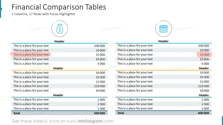
Die Folie stellt einen Finanzvergleich mit zwei Tabellen dar, die jeweils 17 Zeilen enthalten, einschließlich Überschriften und einer Gesamtzeile am Ende. Die Zeilen bestehen aus Platzhaltern für Text, was darauf hindeutet, dass die Daten an spezifische Finanzvergleiche angepasst werden können. Ein Element in jeder Tabelle ist hervorgehoben, um Aufmerksamkeit auf diesen speziellen Datenpunkt zu lenken, was darauf hindeutet, dass es eine besondere Bedeutung haben oder besondere Aufmerksamkeit erfordern könnte. Dies könnte eine nützliche Funktion sein, um wichtige Finanzkennzahlen wie Umsatz, Gewinn oder Kostenpositionen innerhalb einer Präsentation hervorzuheben.
Die Folie hat ein ausgewogenes, symmetrisches Layout mit einer klaren Trennung zwischen den beiden Tabellen. Das übergeordnete Thema ist professionell und datenorientiert, mit dem Ziel, einen direkten Vergleich zwischen zwei Sets von Finanzdaten zu erleichtern.


