Your graphics add a nice touch to my presentations and I recently used them for one of my all-hands meetings. Your toolbox adds professionalism to my slides. Instead of using standard clipart.
Claude Jones, Director of Engineer, @Walmartlabs, USA
Your graphics add a nice touch to my presentations and I recently used them for one of my all-hands meetings. Your toolbox adds professionalism to my slides. Instead of using standard clipart.
Claude Jones, Director of Engineer, @Walmartlabs, USA
I needed a fresh look at some of my slides. I've tried to find a way to create a paintbrush effect, to underline, accentuate, add some color and the handwritten markers were just the things. Very easy to use, easy to size, change the color. It was an affordable, perfect solution and I'm happy to recommend it.
Anonymous, US
The crisp, clean look of the graphics, and the fact that it allowed me to easily edit and change the colors to match the template was my main reason for purchasing them.
Brandie Jenkins, E-learning Developer, USA
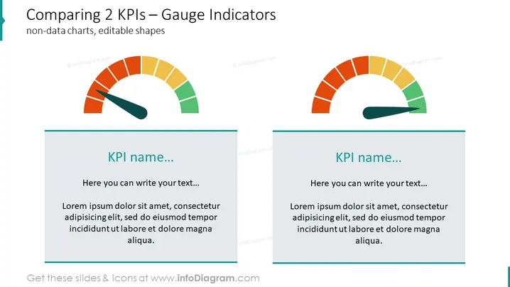
Die Folie zeigt eine visuelle Darstellung zum Vergleich von zwei Key Performance Indicators (KPIs) mithilfe von Messanzeigen. Jede Anzeige bietet einen Überblick über die Leistungsniveaus, die typischerweise farblich kodiert sind, um verschiedene Leistungen oder Problemfelder darzustellen. Zum Beispiel könnte Grün gute Leistung anzeigen, während Rot auf Bereiche hinweisen könnte, die Aufmerksamkeit erfordern. Die Folie enthält Platzhalter für die KPI-Namen und begleitenden Erklärungen unter jeder Anzeige, was demonstriert, wie die Folie mit spezifischen Details angepasst werden kann.
Die Folie hat ein sauberes und professionelles Erscheinungsbild mit einem einfachen Farbschema, das die Messgrafiken hervorhebt, was sie effektiv macht, um schnell vergleichende Leistungsinformationen visuell zu vermitteln.


