

Your graphics add a nice touch to my presentations and I recently used them for one of my all-hands meetings. Your toolbox adds professionalism to my slides. Instead of using standard clipart.
Claude Jones, Director of Engineer, @Walmartlabs, USA

Your graphics add a nice touch to my presentations and I recently used them for one of my all-hands meetings. Your toolbox adds professionalism to my slides. Instead of using standard clipart.
Claude Jones, Director of Engineer, @Walmartlabs, USA
I needed a fresh look at some of my slides. I've tried to find a way to create a paintbrush effect, to underline, accentuate, add some color and the handwritten markers were just the things. Very easy to use, easy to size, change the color. It was an affordable, perfect solution and I'm happy to recommend it.
Anonymous, US
The crisp, clean look of the graphics, and the fact that it allowed me to easily edit and change the colors to match the template was my main reason for purchasing them.
Brandie Jenkins, E-learning Developer, USA
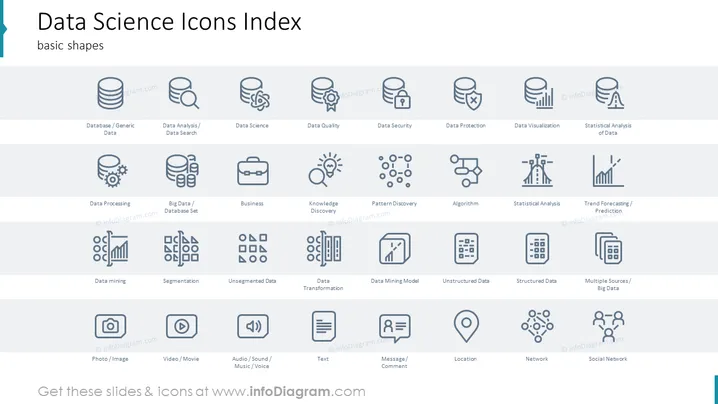
Die Folie mit dem Titel "Index der Datenwissenschafts-Icons" ist ein visuelles Kompendium von Icons, die verschiedene Konzepte und Prozesse in der Datenwissenschaft darstellen, kategorisiert unter "Grundformen". Jedes Icon ist mit Begriffen wie "Datenbank/Generische Daten", "Datenanalyse" und "Strukturierte Daten" beschriftet, um verschiedene Aspekte des Datenmanagements und der Analyse darzustellen. "Datenanalyse/Datenrecherche" deutet darauf hin, Muster innerhalb von Daten zu suchen, während "Datenschutz" die Bedeutung der Datensicherung betont. "Trendprognosen/Vorhersagen" bezieht sich auf die Analyse von Daten zur Vorhersage zukünftiger Trends, und "Soziales Netzwerk" beinhaltet die Abbildung und Analyse sozialer Verbindungen.
Das Gesamtbild der Folie ist sauber und professionell. Der Einsatz monochromatischer Icons und einheitlicher Stile trägt zur visuellen Harmonie bei und erleichtert das Scannen und Verstehen der verschiedenen dargestellten Konzepte der Datenwissenschaft.



