Your graphics add a nice touch to my presentations and I recently used them for one of my all-hands meetings. Your toolbox adds professionalism to my slides. Instead of using standard clipart.
Claude Jones, Director of Engineer, @Walmartlabs, USA
Your graphics add a nice touch to my presentations and I recently used them for one of my all-hands meetings. Your toolbox adds professionalism to my slides. Instead of using standard clipart.
Claude Jones, Director of Engineer, @Walmartlabs, USA
I needed a fresh look at some of my slides. I've tried to find a way to create a paintbrush effect, to underline, accentuate, add some color and the handwritten markers were just the things. Very easy to use, easy to size, change the color. It was an affordable, perfect solution and I'm happy to recommend it.
Anonymous, US
The crisp, clean look of the graphics, and the fact that it allowed me to easily edit and change the colors to match the template was my main reason for purchasing them.
Brandie Jenkins, E-learning Developer, USA
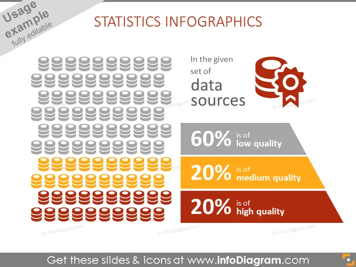
Die PowerPoint-Folie trägt den Titel "STATISTIKEN INFOGRAPHICS" und enthält visuelle Darstellungen, um die Qualität der Datenquellen zu veranschaulichen. Sie zeigt eine große Gruppe ikonographischer Figuren, die Datenbankstapel symbolisieren, wobei verschiedene Farben unterschiedliche Qualitätsniveaus anzeigen: 60% geringe Qualität, 20% mittlere Qualität und 20% hohe Qualität, die den Zuschauern ein sofortiges Verständnis der Anteile jeder Datenqualitätskategorie bietet.
Die Folie verwendet ein Farbcodierungssystem, um das Konzept der Datenqualität einfach zu kommunizieren. Das Layout ist ausgewogen, mit Grafiken auf der linken Seite und erklärendem Text auf der rechten, was eine visuell ansprechende und leicht nachvollziehbare Präsentation gewährleistet.


