Your graphics add a nice touch to my presentations and I recently used them for one of my all-hands meetings. Your toolbox adds professionalism to my slides. Instead of using standard clipart.
Claude Jones, Director of Engineer, @Walmartlabs, USA
Your graphics add a nice touch to my presentations and I recently used them for one of my all-hands meetings. Your toolbox adds professionalism to my slides. Instead of using standard clipart.
Claude Jones, Director of Engineer, @Walmartlabs, USA
I needed a fresh look at some of my slides. I've tried to find a way to create a paintbrush effect, to underline, accentuate, add some color and the handwritten markers were just the things. Very easy to use, easy to size, change the color. It was an affordable, perfect solution and I'm happy to recommend it.
Anonymous, US
The crisp, clean look of the graphics, and the fact that it allowed me to easily edit and change the colors to match the template was my main reason for purchasing them.
Brandie Jenkins, E-learning Developer, USA
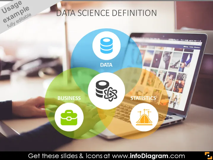
Die Folie konzentriert sich auf die Definition des interdisziplinären Feldes der Datenwissenschaft. Sie unterteilt das Konzept in drei kritische Komponenten: Daten, die die Rohmaterialien veranschaulichen, mit denen Datenwissenschaftler arbeiten; Geschäft, das bezeichnet, wie Datenwissenschaft auf kommerzielle und organisatorische Kontexte anwendbar ist; und Statistik, die das mathematische Fundament angibt, das für die Analyse von Daten verwendet wird. Jedes Element signalisiert, wie diese Bereiche sich überschneiden, um das Reich der Datenwissenschaft zu schaffen.
Die Folie präsentiert eine elegante und moderne visuelle Ausrichtung, mit einem Venn-Diagramm als Mittelpunkt, um die Beziehung zwischen verschiedenen Aspekten der Datenwissenschaft zu demonstrieren. Die Verwendung von Transparenz, Farbe und klaren Symbolen bietet eine visuell ansprechende und leicht verständliche Darstellung des Themas.


