Your graphics add a nice touch to my presentations and I recently used them for one of my all-hands meetings. Your toolbox adds professionalism to my slides. Instead of using standard clipart.
Claude Jones, Director of Engineer, @Walmartlabs, USA
Your graphics add a nice touch to my presentations and I recently used them for one of my all-hands meetings. Your toolbox adds professionalism to my slides. Instead of using standard clipart.
Claude Jones, Director of Engineer, @Walmartlabs, USA
I needed a fresh look at some of my slides. I've tried to find a way to create a paintbrush effect, to underline, accentuate, add some color and the handwritten markers were just the things. Very easy to use, easy to size, change the color. It was an affordable, perfect solution and I'm happy to recommend it.
Anonymous, US
The crisp, clean look of the graphics, and the fact that it allowed me to easily edit and change the colors to match the template was my main reason for purchasing them.
Brandie Jenkins, E-learning Developer, USA
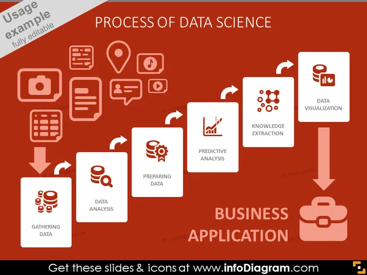
Die Folie zeigt die verschiedenen Phasen der Datenwissenschaft, die zur Geschäftsanwendung führen. Begonnen mit "Daten sammeln", was die Sammlung roher Daten aus verschiedenen Quellen umfasst. "Daten vorbereiten" bedeutet den Prozess der Reinigung und Organisation von Daten für die Analyse. Dann bezieht sich "Datenanalyse" auf die Untersuchung und Verarbeitung von Daten, um nützliche Informationen zu extrahieren. "Prädiktive Analyse" bezieht sich auf die Nutzung von Daten, um zukünftige Trends und Ergebnisse vorherzusagen. "Wissensextraktion" beinhaltet die Ableitung von Erkenntnissen und Mustern aus den analysierten Daten. Der letzte Schritt, "Datenvisualisierung", betrifft die Darstellung von Daten in visuellen Formaten wie Diagrammen oder Grafiken. All diese Schritte führen zur "Geschäftsanwendung", was auf die praktische Umsetzung der Datenkenntnisse hinweist.


