Your graphics add a nice touch to my presentations and I recently used them for one of my all-hands meetings. Your toolbox adds professionalism to my slides. Instead of using standard clipart.
Claude Jones, Director of Engineer, @Walmartlabs, USA
Your graphics add a nice touch to my presentations and I recently used them for one of my all-hands meetings. Your toolbox adds professionalism to my slides. Instead of using standard clipart.
Claude Jones, Director of Engineer, @Walmartlabs, USA
I needed a fresh look at some of my slides. I've tried to find a way to create a paintbrush effect, to underline, accentuate, add some color and the handwritten markers were just the things. Very easy to use, easy to size, change the color. It was an affordable, perfect solution and I'm happy to recommend it.
Anonymous, US
The crisp, clean look of the graphics, and the fact that it allowed me to easily edit and change the colors to match the template was my main reason for purchasing them.
Brandie Jenkins, E-learning Developer, USA
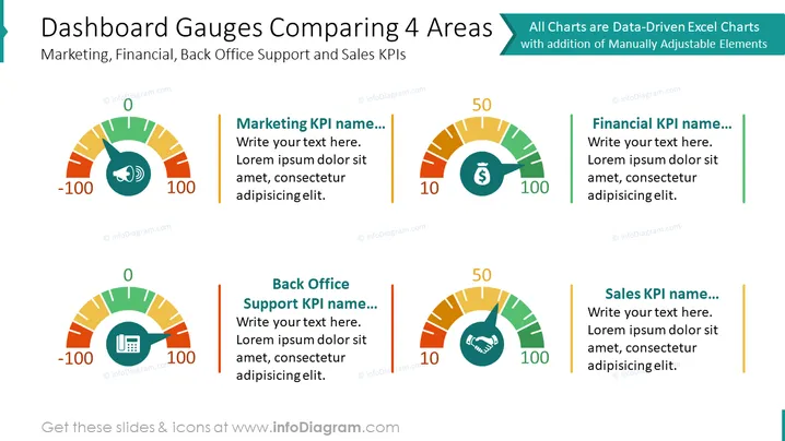
Die Folie trägt den Titel "Dashboard-Anzeigen zum Vergleich von 4 Bereichen" und bietet eine vergleichende Visualisierung von vier verschiedenen Key Performance Indicators (KPIs) in den Bereichen Marketing, Finanzen, Back Office-Support und Vertrieb. Die Folie verwendet Anzeige-Diagramme, um die Messung von -100 bis 100 für jeden Bereich darzustellen, mit einem Abschnitt zur Benennung des KPI und einem Textfeld für zusätzliche Beschreibungen. Jede Anzeige ist farbcodiert und wird von einem Symbol begleitet, das jeweils seinen Bereich darstellt: ein Megaphon für Marketing, ein Geldsymbol für Finanzen, eine Tastatur für das Back Office und ein Handschlag für den Vertrieb.
Die Gesamtdarstellung der Folie ist klar und geschäftsmäßig, mit einer eindeutigen visuellen Unterscheidung zwischen den einzelnen KPI-Bereichen durch den Einsatz von Farben und Symbolen. Die Anzeigediagramme bieten eine intuitive visuelle Metapher für die Leistungsbewertung.


