

Your graphics add a nice touch to my presentations and I recently used them for one of my all-hands meetings. Your toolbox adds professionalism to my slides. Instead of using standard clipart.
Claude Jones, Director of Engineer, @Walmartlabs, USA

Your graphics add a nice touch to my presentations and I recently used them for one of my all-hands meetings. Your toolbox adds professionalism to my slides. Instead of using standard clipart.
Claude Jones, Director of Engineer, @Walmartlabs, USA
I needed a fresh look at some of my slides. I've tried to find a way to create a paintbrush effect, to underline, accentuate, add some color and the handwritten markers were just the things. Very easy to use, easy to size, change the color. It was an affordable, perfect solution and I'm happy to recommend it.
Anonymous, US
The crisp, clean look of the graphics, and the fact that it allowed me to easily edit and change the colors to match the template was my main reason for purchasing them.
Brandie Jenkins, E-learning Developer, USA
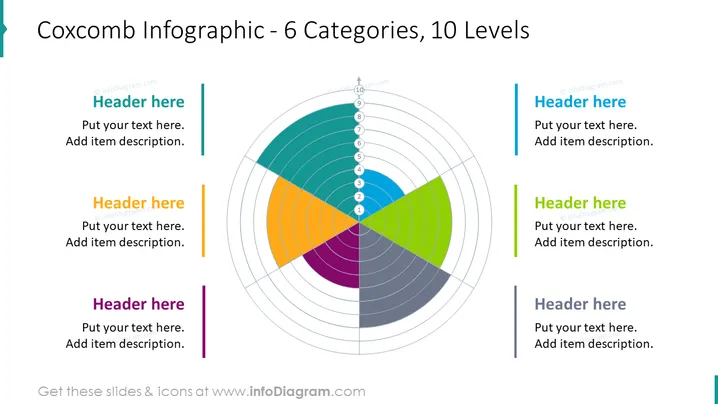
Die Folie präsentiert ein Coxcomb-Diagramm, auch bekannt als polares Flächendiagramm, das in 6 farbige Kategorien unterteilt ist, von denen jede 10 Ebenen enthält, um Daten proportional innerhalb einer Kategorie darzustellen. Begleitend zum Diagramm gibt es Platzhalter für sechs Überschriften und beschreibende Texte, vermutlich um jede Kategorie des Coxcomb-Diagramms näher zu erläutern. Die Infografik eignet sich hervorragend, um darzustellen, wie Segmente eines Ganzen nicht nur nach Proportion, sondern auch über bestimmte Ebenen oder Grade von Bedeutung oder Größe variieren können.
Die Folie hat insgesamt ein modernes und sauberes Design, mit einer ausgewogenen Verwendung von Farben und Weißraum, um die Visualisierung zu betonen. Die symmetrische Anordnung rund um das zentrale Coxcomb-Diagramm schafft ein harmonisches und leicht nachvollziehbares Layout.



