

Your graphics add a nice touch to my presentations and I recently used them for one of my all-hands meetings. Your toolbox adds professionalism to my slides. Instead of using standard clipart.
Claude Jones, Director of Engineer, @Walmartlabs, USA

Your graphics add a nice touch to my presentations and I recently used them for one of my all-hands meetings. Your toolbox adds professionalism to my slides. Instead of using standard clipart.
Claude Jones, Director of Engineer, @Walmartlabs, USA
I needed a fresh look at some of my slides. I've tried to find a way to create a paintbrush effect, to underline, accentuate, add some color and the handwritten markers were just the things. Very easy to use, easy to size, change the color. It was an affordable, perfect solution and I'm happy to recommend it.
Anonymous, US
The crisp, clean look of the graphics, and the fact that it allowed me to easily edit and change the colors to match the template was my main reason for purchasing them.
Brandie Jenkins, E-learning Developer, USA
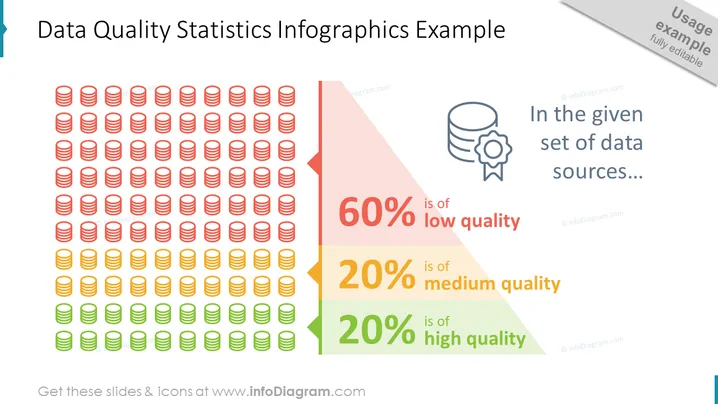
Die PowerPoint-Folie veranschaulicht die Qualitätsverteilung eines Datensatzes durch eine statistische Infografik. Sie quantifiziert die Datenqualität in drei Kategorien: 60% der Daten sind von niedriger Qualität, was auf erhebliche Probleme hinweist, die angegangen werden müssen. 20% sind von mittlerer Qualität, was möglicherweise eine Verbesserung erfordert. Schließlich sind 20% von hoher Qualität, was darauf hindeutet, dass dieser Teil der Daten die gewünschten Standards für Analyse und Entscheidungsfindung erfüllt.
Die Folie verwendet Farbcode und einfache Symbole, um die Botschaft über die Datenqualitätslevels effektiv zu vermitteln. Die grafischen Elemente sind so angeordnet, dass sie ein schnelles visuelles Verständnis der Verteilung der Datenqualität bieten.



