Your graphics add a nice touch to my presentations and I recently used them for one of my all-hands meetings. Your toolbox adds professionalism to my slides. Instead of using standard clipart.
Claude Jones, Director of Engineer, @Walmartlabs, USA
Your graphics add a nice touch to my presentations and I recently used them for one of my all-hands meetings. Your toolbox adds professionalism to my slides. Instead of using standard clipart.
Claude Jones, Director of Engineer, @Walmartlabs, USA
I needed a fresh look at some of my slides. I've tried to find a way to create a paintbrush effect, to underline, accentuate, add some color and the handwritten markers were just the things. Very easy to use, easy to size, change the color. It was an affordable, perfect solution and I'm happy to recommend it.
Anonymous, US
The crisp, clean look of the graphics, and the fact that it allowed me to easily edit and change the colors to match the template was my main reason for purchasing them.
Brandie Jenkins, E-learning Developer, USA
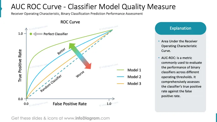
Diese PowerPoint-Folie trägt den Titel "AUC ROC Kurve - Qualitätsmaß für Klassifizierungsmodelle" und erörtert die Receiver Operating Characteristic (ROC) Kurve als Methode zur Bewertung der Leistung binärer Klassifizierungsmodelle. Die ROC-Kurve ist ein grafisches Diagramm, das die diagnostische Fähigkeit eines binären Klassifikationssystems veranschaulicht, während sich die Diskriminierungsschwelle ändert. Der Titel bezieht sich auf die Fläche unter der Kurve (AUC) der ROC, die ein Maß dafür ist, wie gut ein Parameter zwischen zwei Diagnosengruppen (krank/gesund) unterscheiden kann. Ein perfekter Klassifizierer ist oben links auf der Kurve angezeigt.
Die visuelle Komposition der Folie ist ausgewogen, wobei das Diagramm den Großteil des Raums einnimmt und der Erklärungsabschnitt sauber nach rechts ausgerichtet ist. Der Einsatz von Farben ist konsistent und unterstützt die Unterscheidung verschiedener Informationen.


