Your graphics add a nice touch to my presentations and I recently used them for one of my all-hands meetings. Your toolbox adds professionalism to my slides. Instead of using standard clipart.
Claude Jones, Director of Engineer, @Walmartlabs, USA
Your graphics add a nice touch to my presentations and I recently used them for one of my all-hands meetings. Your toolbox adds professionalism to my slides. Instead of using standard clipart.
Claude Jones, Director of Engineer, @Walmartlabs, USA
I needed a fresh look at some of my slides. I've tried to find a way to create a paintbrush effect, to underline, accentuate, add some color and the handwritten markers were just the things. Very easy to use, easy to size, change the color. It was an affordable, perfect solution and I'm happy to recommend it.
Anonymous, US
The crisp, clean look of the graphics, and the fact that it allowed me to easily edit and change the colors to match the template was my main reason for purchasing them.
Brandie Jenkins, E-learning Developer, USA
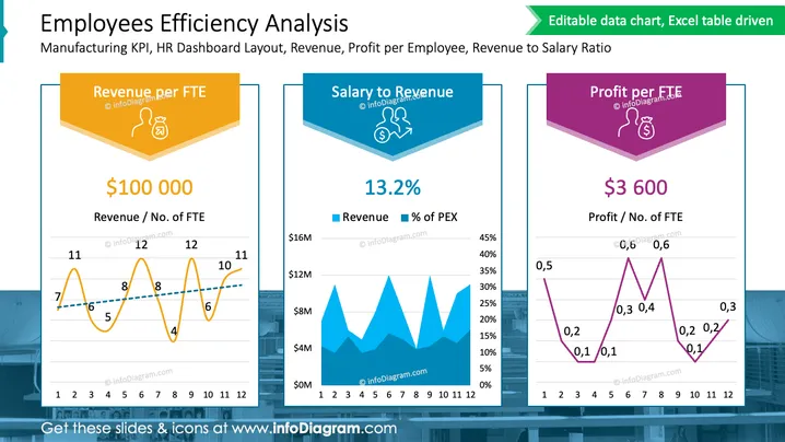
Die Folie präsentiert ein Dashboard-Layout, das sich auf die Effizienz der Mitarbeiter konzentriert, insbesondere auf KPIs in der Fertigung. Es werden drei wichtige Kennzahlen hervorgehoben: Umsatz pro FTE (Vollzeitäquivalent) mit einem Wert von 100.000 $; Verhältnis von Gehalt zu Umsatz bei 13,2%; und Gewinn pro FTE, angegeben mit 3.600 $. Jede Kennzahl wird von einer grafischen Darstellung begleitet - einem Liniendiagramm für Umsatz pro FTE, einem Balkendiagramm, das Umsatz im Vergleich zum Prozentsatz der PEX (Personalkosten) zeigt, und einem weiteren Liniendiagramm für Gewinn pro FTE - das Trends über einen Zeitraum von 12 Monaten darstellt.


