Your graphics add a nice touch to my presentations and I recently used them for one of my all-hands meetings. Your toolbox adds professionalism to my slides. Instead of using standard clipart.
Claude Jones, Director of Engineer, @Walmartlabs, USA
Your graphics add a nice touch to my presentations and I recently used them for one of my all-hands meetings. Your toolbox adds professionalism to my slides. Instead of using standard clipart.
Claude Jones, Director of Engineer, @Walmartlabs, USA
I needed a fresh look at some of my slides. I've tried to find a way to create a paintbrush effect, to underline, accentuate, add some color and the handwritten markers were just the things. Very easy to use, easy to size, change the color. It was an affordable, perfect solution and I'm happy to recommend it.
Anonymous, US
The crisp, clean look of the graphics, and the fact that it allowed me to easily edit and change the colors to match the template was my main reason for purchasing them.
Brandie Jenkins, E-learning Developer, USA
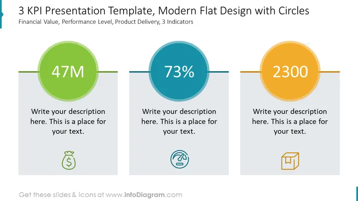
Die Folie bietet eine visuelle Darstellung von drei Schlüsselkennzahlen (KPIs), die jeweils in einem andersfarbigen Kreis dargestellt sind. "47M" repräsentiert einen finanziellen Wert, der ein monetäres Maß wie Umsatz oder Budget andeutet, was normalerweise entscheidend für die Finanzberichterstattung oder Zielsetzung ist. "73%" ist ein Indikator für das Leistungsniveau, der möglicherweise auf Effizienz, Abschlussquote oder Kundenzufriedenheit verweist, die für das Leistungsmanagement wesentlich sind. "2300" könnte eine Kennzahl für die Produktlieferung darstellen, wie verkaufte oder ausgelieferte Einheiten, die für operative und Verkaufsstrategien bedeutend ist. Platzhaltertext unter jedem KPI zeigt an, wo zusätzliche Erklärungen hinzugefügt werden können.


