Your graphics add a nice touch to my presentations and I recently used them for one of my all-hands meetings. Your toolbox adds professionalism to my slides. Instead of using standard clipart.
Claude Jones, Director of Engineer, @Walmartlabs, USA
Your graphics add a nice touch to my presentations and I recently used them for one of my all-hands meetings. Your toolbox adds professionalism to my slides. Instead of using standard clipart.
Claude Jones, Director of Engineer, @Walmartlabs, USA
I needed a fresh look at some of my slides. I've tried to find a way to create a paintbrush effect, to underline, accentuate, add some color and the handwritten markers were just the things. Very easy to use, easy to size, change the color. It was an affordable, perfect solution and I'm happy to recommend it.
Anonymous, US
The crisp, clean look of the graphics, and the fact that it allowed me to easily edit and change the colors to match the template was my main reason for purchasing them.
Brandie Jenkins, E-learning Developer, USA
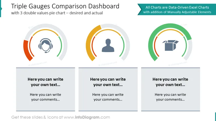
The slide presents a "Triple Gauges Comparison Dashboard" with three semi-circular gauges representing a comparison between desired and actual values. Each gauge has two segments indicating progress or achievement levels. The gauges are accompanied with text boxes below where one can input relevant commentary or descriptions. These gauges are useful for visualizing performance metrics, goal achievements, or other measurable outcomes. The label indicates that the charts are data-driven from Excel and can be manually adjusted as needed.
The overall look of the slide is professional and clean, with a focus on the visual gauges that are designed for easy interpretation of data. The use of color not only differentiates between the gauges but also adds a visual hierarchy to the information being presented.


