Your graphics add a nice touch to my presentations and I recently used them for one of my all-hands meetings. Your toolbox adds professionalism to my slides. Instead of using standard clipart.
Claude Jones, Director of Engineer, @Walmartlabs, USA
Your graphics add a nice touch to my presentations and I recently used them for one of my all-hands meetings. Your toolbox adds professionalism to my slides. Instead of using standard clipart.
Claude Jones, Director of Engineer, @Walmartlabs, USA
I needed a fresh look at some of my slides. I've tried to find a way to create a paintbrush effect, to underline, accentuate, add some color and the handwritten markers were just the things. Very easy to use, easy to size, change the color. It was an affordable, perfect solution and I'm happy to recommend it.
Anonymous, US
The crisp, clean look of the graphics, and the fact that it allowed me to easily edit and change the colors to match the template was my main reason for purchasing them.
Brandie Jenkins, E-learning Developer, USA
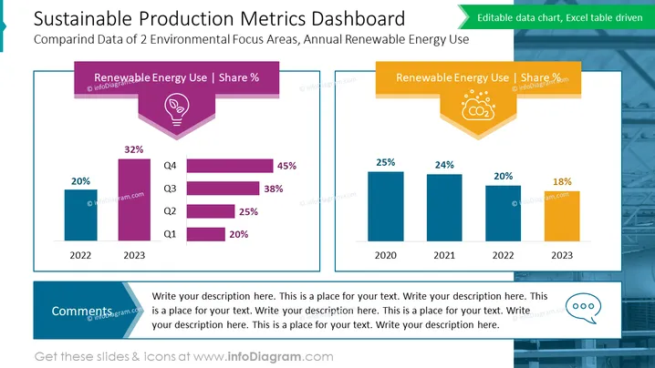
The slide titled "Sustainable Production Metrics Dashboard" compares the data of two environmental focus areas, specifically the annual renewable energy use across different years. The slide is divided into two sections. The left section, under the subheading "Renewable Energy Use | Share %," presents a vertical bar chart and a stacked horizontal bar chart showing an increase from 20% in 2022 to 45% in 2023, indicating a positive trend in renewable energy use across subsequent quarters (Q1 to Q4). The right section also features a title "Renewable Energy Use | Share %," but this part showcases a vertical bar chart indicating a general decrease in the percentage of renewable energy use from 25% in 2020 to 18% in 2023, illustrating an overall downward trend.
The slide uses a professional color scheme of blues, purples, and oranges to visually separate information. The use of icons and contrasting colors for charts effectively highlights the data points and makes the information easily digestible.


