Your graphics add a nice touch to my presentations and I recently used them for one of my all-hands meetings. Your toolbox adds professionalism to my slides. Instead of using standard clipart.
Claude Jones, Director of Engineer, @Walmartlabs, USA
Your graphics add a nice touch to my presentations and I recently used them for one of my all-hands meetings. Your toolbox adds professionalism to my slides. Instead of using standard clipart.
Claude Jones, Director of Engineer, @Walmartlabs, USA
I needed a fresh look at some of my slides. I've tried to find a way to create a paintbrush effect, to underline, accentuate, add some color and the handwritten markers were just the things. Very easy to use, easy to size, change the color. It was an affordable, perfect solution and I'm happy to recommend it.
Anonymous, US
The crisp, clean look of the graphics, and the fact that it allowed me to easily edit and change the colors to match the template was my main reason for purchasing them.
Brandie Jenkins, E-learning Developer, USA
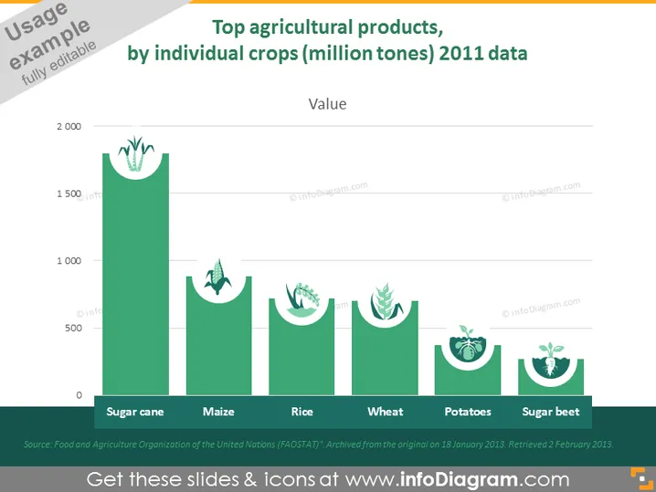
The slide presents data on the usage of top agricultural products measured in million tonnes for the year 2011. It outlines five different crops: Sugar cane, Maize, Rice, Wheat, Potatoes, and Sugar beet, each represented with a corresponding bar height indicating quantity. Sugar cane shows the highest usage, followed by maize, rice, wheat, potatoes, and sugar beet in decreasing order of the amount produced. The source of the data is cited as the Food and Agriculture Organization of the United Nations (FAOSTAT).
The slide has a clean and modern appearance, with a color scheme that emphasizes eco-friendly agriculture. The use of icons and data visualization makes the information digestible and visually appealing.


