Your graphics add a nice touch to my presentations and I recently used them for one of my all-hands meetings. Your toolbox adds professionalism to my slides. Instead of using standard clipart.
Claude Jones, Director of Engineer, @Walmartlabs, USA
Your graphics add a nice touch to my presentations and I recently used them for one of my all-hands meetings. Your toolbox adds professionalism to my slides. Instead of using standard clipart.
Claude Jones, Director of Engineer, @Walmartlabs, USA
I needed a fresh look at some of my slides. I've tried to find a way to create a paintbrush effect, to underline, accentuate, add some color and the handwritten markers were just the things. Very easy to use, easy to size, change the color. It was an affordable, perfect solution and I'm happy to recommend it.
Anonymous, US
The crisp, clean look of the graphics, and the fact that it allowed me to easily edit and change the colors to match the template was my main reason for purchasing them.
Brandie Jenkins, E-learning Developer, USA
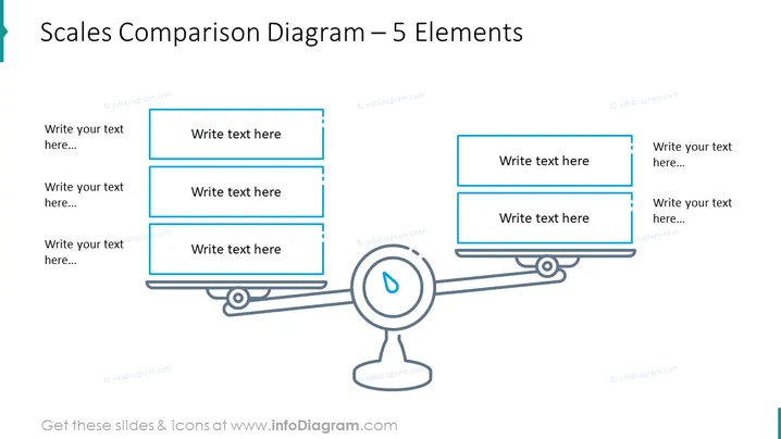
The slide entitled "Scales Comparison Diagram – 5 Elements" depicts a balance scale comparison diagram which is used to represent a comparison or balance of ideas, concepts, or topics. Each side of the scale has placeholders for three elements, indicated by rectangular shapes with text "Write text here...". These placeholders suggest that the presenter can add their own content, explaining that each side can consist of various components that should be weighed against each other.
The slide has a modern and professional style, predominantly using blue tones on a white background. The design is minimalistic, enhancing readability and focus on the content areas.


