Your graphics add a nice touch to my presentations and I recently used them for one of my all-hands meetings. Your toolbox adds professionalism to my slides. Instead of using standard clipart.
Claude Jones, Director of Engineer, @Walmartlabs, USA
Your graphics add a nice touch to my presentations and I recently used them for one of my all-hands meetings. Your toolbox adds professionalism to my slides. Instead of using standard clipart.
Claude Jones, Director of Engineer, @Walmartlabs, USA
I needed a fresh look at some of my slides. I've tried to find a way to create a paintbrush effect, to underline, accentuate, add some color and the handwritten markers were just the things. Very easy to use, easy to size, change the color. It was an affordable, perfect solution and I'm happy to recommend it.
Anonymous, US
The crisp, clean look of the graphics, and the fact that it allowed me to easily edit and change the colors to match the template was my main reason for purchasing them.
Brandie Jenkins, E-learning Developer, USA
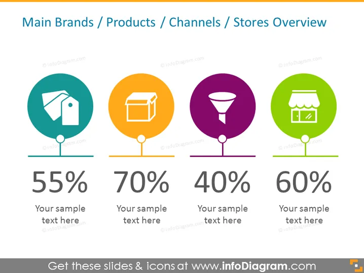
This slide provides a visual overview of different metrics for main brands, products, channels, or stores. It contains four distinct sections, each with a colored circle icon, a unique image representing different aspects of business, a large percentage figure, and a placeholder for additional text. The first icon appears to represent a tag, suggesting brand identification or sales, showing 55% with a placeholder for text explanation. The second with a box icon possibly stands for products, displaying 70% and a sample text placeholder. The third features a funnel, indicating sales or marketing channels, associated with 40% and a place for descriptive text. The last icon represents a store, implying physical retail locations or store performance metrics, with 60% and a sample text space.
The slide is clean and minimalistic, using bold colors and simple graphics to convey information quickly. The visual hierarchy is clear, directing focus to the icons and percentages followed by supporting text.


