Your graphics add a nice touch to my presentations and I recently used them for one of my all-hands meetings. Your toolbox adds professionalism to my slides. Instead of using standard clipart.
Claude Jones, Director of Engineer, @Walmartlabs, USA
Your graphics add a nice touch to my presentations and I recently used them for one of my all-hands meetings. Your toolbox adds professionalism to my slides. Instead of using standard clipart.
Claude Jones, Director of Engineer, @Walmartlabs, USA
I needed a fresh look at some of my slides. I've tried to find a way to create a paintbrush effect, to underline, accentuate, add some color and the handwritten markers were just the things. Very easy to use, easy to size, change the color. It was an affordable, perfect solution and I'm happy to recommend it.
Anonymous, US
The crisp, clean look of the graphics, and the fact that it allowed me to easily edit and change the colors to match the template was my main reason for purchasing them.
Brandie Jenkins, E-learning Developer, USA
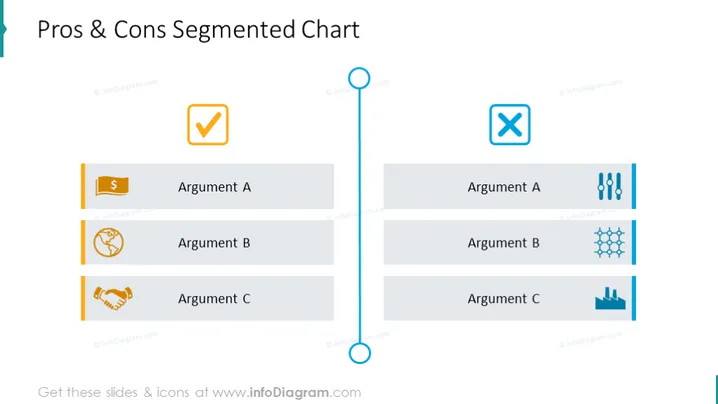
This slide is designed to visually represent a comparison between the pros and cons of certain arguments or options. There are three sections labeled "Argument A," "Argument B," and "Argument C," each paired with a distinct icon on both the pros and cons sides. These icons likely represent financial impact, global or cyclic factors, partnership or agreement for the pros, data analysis, operational or technical aspects, and downward trends for the cons, providing a symbolic representation of various business considerations.
The slide has a balanced, clean design, with symmetrical layouts and contrasting colors that effectively differentiate between positive and negative aspects. The use of icons adds a visual element that can quickly convey the essence of each argument.




