Your graphics add a nice touch to my presentations and I recently used them for one of my all-hands meetings. Your toolbox adds professionalism to my slides. Instead of using standard clipart.
Claude Jones, Director of Engineer, @Walmartlabs, USA
Your graphics add a nice touch to my presentations and I recently used them for one of my all-hands meetings. Your toolbox adds professionalism to my slides. Instead of using standard clipart.
Claude Jones, Director of Engineer, @Walmartlabs, USA
I needed a fresh look at some of my slides. I've tried to find a way to create a paintbrush effect, to underline, accentuate, add some color and the handwritten markers were just the things. Very easy to use, easy to size, change the color. It was an affordable, perfect solution and I'm happy to recommend it.
Anonymous, US
The crisp, clean look of the graphics, and the fact that it allowed me to easily edit and change the colors to match the template was my main reason for purchasing them.
Brandie Jenkins, E-learning Developer, USA
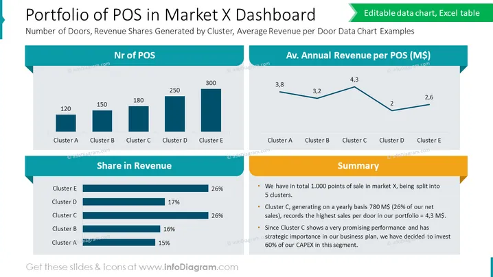
The slide titled "Portfolio of POS in Market X Dashboard" presents data on the distribution and financial performance of points of sale (POS) across different clusters in a market. It shows the "Number of Doors, Revenue Shares Generated by Cluster, Average Revenue per Door Data Chart Examples." The number of POS per cluster is illustrated in a bar chart for clusters A to E, suggesting the magnitude of operations in each cluster. Additionally, "Share in Revenue" is shown in horizontal bars, indicating Cluster E's dominance, being on par with Cluster D. A line graph depicts the "Av. Annual Revenue per POS (M$)," where Cluster C has the highest average revenue. Lastly, a "Summary" section highlights key insights: 1,000 total POS, Cluster C claiming a significant share of yearly sales, and plans to invest heavily in this promising segment.
The overall look of the slide is clean, modern, and data-focused, utilizing blue tones and yellow accents to draw attention to key metrics and summaries. These visual elements guide the viewer's eye through the data in a logical flow.


