Your graphics add a nice touch to my presentations and I recently used them for one of my all-hands meetings. Your toolbox adds professionalism to my slides. Instead of using standard clipart.
Claude Jones, Director of Engineer, @Walmartlabs, USA
Your graphics add a nice touch to my presentations and I recently used them for one of my all-hands meetings. Your toolbox adds professionalism to my slides. Instead of using standard clipart.
Claude Jones, Director of Engineer, @Walmartlabs, USA
I needed a fresh look at some of my slides. I've tried to find a way to create a paintbrush effect, to underline, accentuate, add some color and the handwritten markers were just the things. Very easy to use, easy to size, change the color. It was an affordable, perfect solution and I'm happy to recommend it.
Anonymous, US
The crisp, clean look of the graphics, and the fact that it allowed me to easily edit and change the colors to match the template was my main reason for purchasing them.
Brandie Jenkins, E-learning Developer, USA
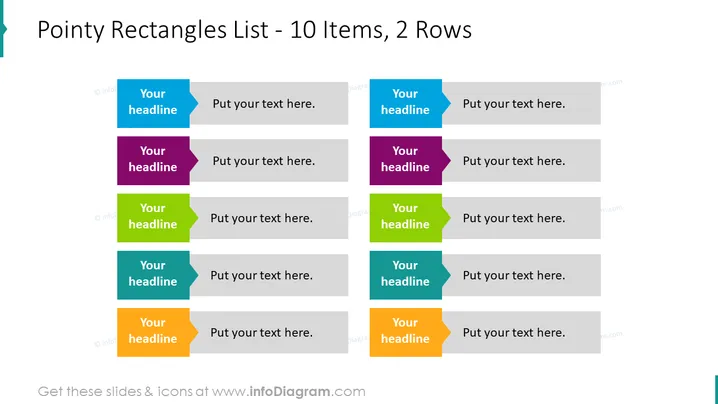
The slide is designed to showcase a list of 10 items distributed across two rows. Each item is labeled 'Your headline' followed by placeholder text 'Put your text here.', inviting the presenter to customize the content. These items can represent steps, options, or any categorized information, having individual colorful pointers indicating their distinctiveness. The dual-row configuration allows for a clear comparison or a sequential flow of information across two parallel tracks.
The slide features a simple and clean design, using color-coded chevrons to visually distinguish different items. The pointed ends add dynamism to the design, while the use of space and alignment creates an organized structure.


