Your graphics add a nice touch to my presentations and I recently used them for one of my all-hands meetings. Your toolbox adds professionalism to my slides. Instead of using standard clipart.
Claude Jones, Director of Engineer, @Walmartlabs, USA
Your graphics add a nice touch to my presentations and I recently used them for one of my all-hands meetings. Your toolbox adds professionalism to my slides. Instead of using standard clipart.
Claude Jones, Director of Engineer, @Walmartlabs, USA
I needed a fresh look at some of my slides. I've tried to find a way to create a paintbrush effect, to underline, accentuate, add some color and the handwritten markers were just the things. Very easy to use, easy to size, change the color. It was an affordable, perfect solution and I'm happy to recommend it.
Anonymous, US
The crisp, clean look of the graphics, and the fact that it allowed me to easily edit and change the colors to match the template was my main reason for purchasing them.
Brandie Jenkins, E-learning Developer, USA
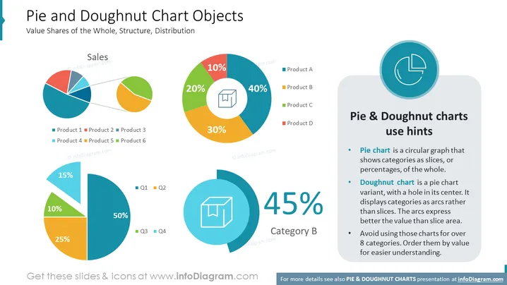
The slide titled "Pie and Doughnut Chart Objects" focuses on the visual representation of data using pie and doughnut charts to show value shares of the whole, structure, and distribution. Three differently colored pie charts demonstrate the sales distribution among products labeled Product 1 to Product 6 or time divisions such as Q1 to Q4. A large doughnut chart highlights the dominance of Product A at 40%, followed by B, C, and D. A text box provides use hints for pie and doughnut charts, emphasizing their application for displaying categories as slices or arcs and recommending limiting the number of categories for clarity.
The slide's design is dynamic, with the charts adding visual interest and the careful placement of elements creating a balanced composition. The use of color is both appealing and functional, aiding in the differentiation of data points.


