Your graphics add a nice touch to my presentations and I recently used them for one of my all-hands meetings. Your toolbox adds professionalism to my slides. Instead of using standard clipart.
Claude Jones, Director of Engineer, @Walmartlabs, USA
Your graphics add a nice touch to my presentations and I recently used them for one of my all-hands meetings. Your toolbox adds professionalism to my slides. Instead of using standard clipart.
Claude Jones, Director of Engineer, @Walmartlabs, USA
I needed a fresh look at some of my slides. I've tried to find a way to create a paintbrush effect, to underline, accentuate, add some color and the handwritten markers were just the things. Very easy to use, easy to size, change the color. It was an affordable, perfect solution and I'm happy to recommend it.
Anonymous, US
The crisp, clean look of the graphics, and the fact that it allowed me to easily edit and change the colors to match the template was my main reason for purchasing them.
Brandie Jenkins, E-learning Developer, USA
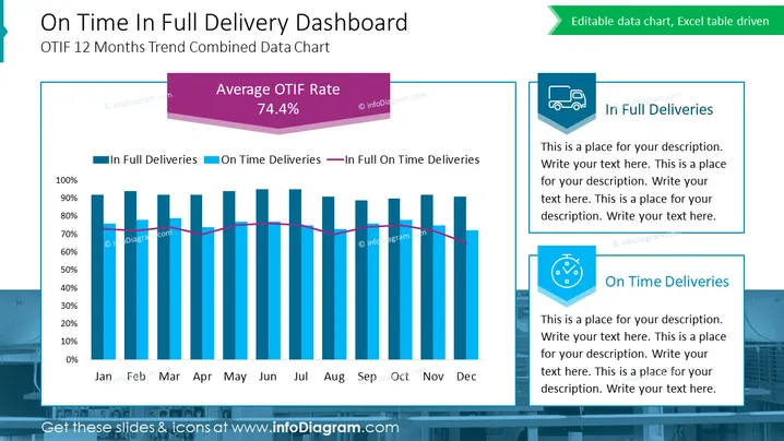
This PowerPoint slide is titled "On Time In Full Delivery Dashboard" and details the OTIF 12 Months Trend Combined Data Chart. It showcases a bar and line chart tracking 'In Full Deliveries', 'On Time Deliveries', and their intersection 'In Full On Time Deliveries' across months from January to December. A large, prominent element highlights the "Average OTIF Rate" at 74.4%. The slide contains placeholders for additional text explanations under the headers 'In Full Deliveries' and 'On Time Deliveries', each accompanied by a related icon, suggesting that these sections are intended for customizable descriptions.
The slide has a clean, corporate aesthetic with a well-organized layout that focuses attention on the data visualization. The use of colored elements and icons facilitates quick comprehension of the chart's meaning and purpose.


