

Your graphics add a nice touch to my presentations and I recently used them for one of my all-hands meetings. Your toolbox adds professionalism to my slides. Instead of using standard clipart.
Claude Jones, Director of Engineer, @Walmartlabs, USA

Your graphics add a nice touch to my presentations and I recently used them for one of my all-hands meetings. Your toolbox adds professionalism to my slides. Instead of using standard clipart.
Claude Jones, Director of Engineer, @Walmartlabs, USA
I needed a fresh look at some of my slides. I've tried to find a way to create a paintbrush effect, to underline, accentuate, add some color and the handwritten markers were just the things. Very easy to use, easy to size, change the color. It was an affordable, perfect solution and I'm happy to recommend it.
Anonymous, US
The crisp, clean look of the graphics, and the fact that it allowed me to easily edit and change the colors to match the template was my main reason for purchasing them.
Brandie Jenkins, E-learning Developer, USA
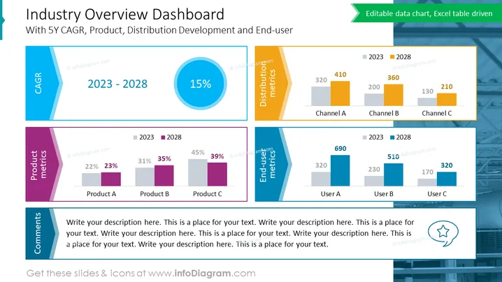
With 5Y CAGR, Product, Distribution Development and End-user
The slide presents a comprehensive "Industry Overview Dashboard" featuring a 5-year compound annual growth rate (CAGR), product metrics, distribution metrics, and end-user metrics. The CAGR is shown as a 15% increase in a circular graph. Product metrics are displayed for three products (A, B, C), showing percentage changes over time. Distribution metrics highlight channel performance (A, B, C) in terms of numerical values, also compared over time. End-user metrics illustrate changes in user segments (A, B, C) from 2023 to 2028. Lastly, a comments section is provided for additional narratives or data explanations.
The slide overall has a clean and modern design with a cohesive color palette and clear deline aphics that separate data visually. Information is presented in a visually hierarchical structure that is easy to follow.



