

Your graphics add a nice touch to my presentations and I recently used them for one of my all-hands meetings. Your toolbox adds professionalism to my slides. Instead of using standard clipart.
Claude Jones, Director of Engineer, @Walmartlabs, USA

Your graphics add a nice touch to my presentations and I recently used them for one of my all-hands meetings. Your toolbox adds professionalism to my slides. Instead of using standard clipart.
Claude Jones, Director of Engineer, @Walmartlabs, USA
I needed a fresh look at some of my slides. I've tried to find a way to create a paintbrush effect, to underline, accentuate, add some color and the handwritten markers were just the things. Very easy to use, easy to size, change the color. It was an affordable, perfect solution and I'm happy to recommend it.
Anonymous, US
The crisp, clean look of the graphics, and the fact that it allowed me to easily edit and change the colors to match the template was my main reason for purchasing them.
Brandie Jenkins, E-learning Developer, USA
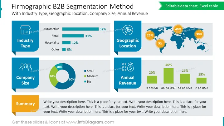
The slide presents a firmographic B2B segmentation strategy, focusing on industry type, geographic location, company size, and annual revenue. "Industry Type" shows a horizontal bar chart with percentages: Automotive has 52%, Retail has 31%, Hospitality is at 12%, and Other at 5%. "Company Size" is represented with a pie chart indicating Small (60%), Medium (30%), and Big (10%). "Geographic Location" is depicted on a world map with pie charts over continents: Americas (40%), Europe (30%), Asia-Pacific (25%), and Other (5%). "Annual Revenue" uses a horizontal bar chart with ranges: ≤ $XXUSD (20%), $XX-XX USD (25%), $XX-XX USD (40%), and ≥ $XX USD (15%). A "Summary" text box prompts to add a descriptive text.
A bold title "Firmographic B2B Segmentation Method" is centered at the top of the slide in large, dark text.
Four colored content boxes, each with a unique icon at the top left corner to represent the category: a monitor for "Industry Type," two figures for "Company Size," a globe for "Geographic Location," and a dollar sign in a circle for "Annual Revenue."
The "Industry Type" section includes a horizontal bar chart with different lengths and a percentage for each industry.
"Company Size" is illustrated with a segmented circular pie chart with three distinct colors for different company sizes.
The "Geographic Location" is shown with a world map in a muted color, with three pie charts positioned over the Americas, Europe, and Asia-Pacific regions, each with a different percentage indicated.
"Annual Revenue" showcases a simple bar chart where each bar corresponds to a specific revenue range labeled underneath.
A yellow rectangular "Summary" box is positioned at the bottom with ### Use Cases
To present market segmentation data in a business strategy meeting.
For marketing teams to visualize target demographics during a campaign planning session.
As part of a sales presentation to highlight potential customer segments based on firmographics.
In an investor pitch to showcase the company's understanding of its market and revenue distribution across different segments.



