Your graphics add a nice touch to my presentations and I recently used them for one of my all-hands meetings. Your toolbox adds professionalism to my slides. Instead of using standard clipart.
Claude Jones, Director of Engineer, @Walmartlabs, USA
Your graphics add a nice touch to my presentations and I recently used them for one of my all-hands meetings. Your toolbox adds professionalism to my slides. Instead of using standard clipart.
Claude Jones, Director of Engineer, @Walmartlabs, USA
I needed a fresh look at some of my slides. I've tried to find a way to create a paintbrush effect, to underline, accentuate, add some color and the handwritten markers were just the things. Very easy to use, easy to size, change the color. It was an affordable, perfect solution and I'm happy to recommend it.
Anonymous, US
The crisp, clean look of the graphics, and the fact that it allowed me to easily edit and change the colors to match the template was my main reason for purchasing them.
Brandie Jenkins, E-learning Developer, USA
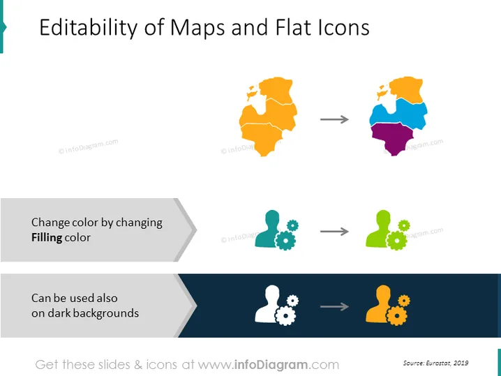
The slide shows how maps and flat icons can be edited for presentation purposes. It illustrates the process of changing colors to suit different backgrounds, indicating versatility in design. For maps, there's an example of an orange map being modified into a multicolored one, showing regional distinction. The icons below depict a pair of users and gears shifting from a gray to a green color scheme, and then to a white color scheme against a dark background, emphasizing adaptability in visual elements.
The slide is visually clean and uncluttered, using minimalistic design elements to clearly show the color editability of graphics. The use of contrasting backgrounds for the icons serves to highlight their versatility on different background colors.


