Your graphics add a nice touch to my presentations and I recently used them for one of my all-hands meetings. Your toolbox adds professionalism to my slides. Instead of using standard clipart.
Claude Jones, Director of Engineer, @Walmartlabs, USA
Your graphics add a nice touch to my presentations and I recently used them for one of my all-hands meetings. Your toolbox adds professionalism to my slides. Instead of using standard clipart.
Claude Jones, Director of Engineer, @Walmartlabs, USA
I needed a fresh look at some of my slides. I've tried to find a way to create a paintbrush effect, to underline, accentuate, add some color and the handwritten markers were just the things. Very easy to use, easy to size, change the color. It was an affordable, perfect solution and I'm happy to recommend it.
Anonymous, US
The crisp, clean look of the graphics, and the fact that it allowed me to easily edit and change the colors to match the template was my main reason for purchasing them.
Brandie Jenkins, E-learning Developer, USA
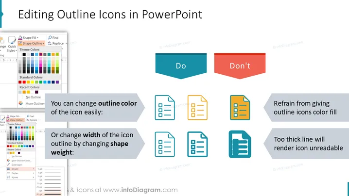
The PowerPoint slide titled "Editing Outline Icons in PowerPoint" provides guidance on customizing icons in PowerPoint presentations. It illustrates proper techniques for changing the outline color and width of icons, advising to easily modify the outline color and to adjust the icon outline width by altering the shape weight. Additionally, it warns against filling outline icons with color and making the outline too thick, as this can make the icon unreadable. Each point is exemplified with visual icons representing the do's and don'ts, making the instructions clear and straightforward.
The slide is visually balanced, with clear demarcations between instructional areas and examples. Its clean design uses symbolic color coding—teal for "Do" and red for "Don't"—to reinforce the instructional content effectively.


