Your graphics add a nice touch to my presentations and I recently used them for one of my all-hands meetings. Your toolbox adds professionalism to my slides. Instead of using standard clipart.
Claude Jones, Director of Engineer, @Walmartlabs, USA
Your graphics add a nice touch to my presentations and I recently used them for one of my all-hands meetings. Your toolbox adds professionalism to my slides. Instead of using standard clipart.
Claude Jones, Director of Engineer, @Walmartlabs, USA
I needed a fresh look at some of my slides. I've tried to find a way to create a paintbrush effect, to underline, accentuate, add some color and the handwritten markers were just the things. Very easy to use, easy to size, change the color. It was an affordable, perfect solution and I'm happy to recommend it.
Anonymous, US
The crisp, clean look of the graphics, and the fact that it allowed me to easily edit and change the colors to match the template was my main reason for purchasing them.
Brandie Jenkins, E-learning Developer, USA
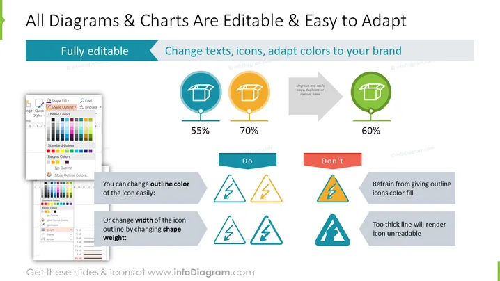
This PowerPoint slide presents the customization options for diagrams and charts, emphasizing their editable nature and flexibility in adaptation to a brand's visual identity. It showcases examples of how to change icon outline colors and shape weights, illustrating good and bad practices with percentage scores that indicate the effectiveness of each approach. Key actionable items include the ability for full customization, changing texts, adapting icons, and adjusting to brand colors. The slide lists essential do's and don'ts: do change the outline color and shape weight, but don't give outline icons a color fill or use excessively thick lines as they reduce readability.
The slide has a light background with a header banner of turquoise blue.
Title text in black, using a large, bold font that stands out.
Three circular icons in a row, each with a percentage beneath them, representing levels of customization. They are colored in teal, orange, and green.
Adjacent to each icon is an arrow leading to a graphic with a text box showcasing best practices.
A set of three warning and advice triangles beneath the row of circular icons, illustrating incorrect practices.
Each triangular icon set comes with an accompanying explanation, colored in red for 'Don't' and blue for 'Do'.
A sizable screenshot of a color and outline selection menu from PowerPoint features in the bottom left corner.
The layout is balanced with a good mix of text, icons, and images.
The overall look of the slide is professional and visually appealing, using color coordination and iconography to effectively communicate the customization possibilities in PowerPoint.


