Your graphics add a nice touch to my presentations and I recently used them for one of my all-hands meetings. Your toolbox adds professionalism to my slides. Instead of using standard clipart.
Claude Jones, Director of Engineer, @Walmartlabs, USA
Your graphics add a nice touch to my presentations and I recently used them for one of my all-hands meetings. Your toolbox adds professionalism to my slides. Instead of using standard clipart.
Claude Jones, Director of Engineer, @Walmartlabs, USA
I needed a fresh look at some of my slides. I've tried to find a way to create a paintbrush effect, to underline, accentuate, add some color and the handwritten markers were just the things. Very easy to use, easy to size, change the color. It was an affordable, perfect solution and I'm happy to recommend it.
Anonymous, US
The crisp, clean look of the graphics, and the fact that it allowed me to easily edit and change the colors to match the template was my main reason for purchasing them.
Brandie Jenkins, E-learning Developer, USA
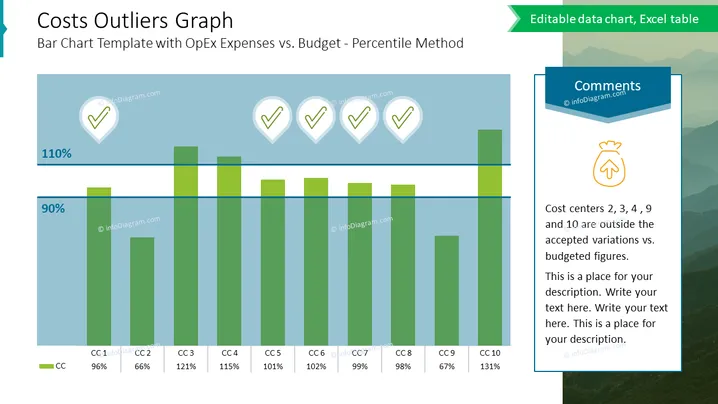
This slide is titled "Costs Outliers Graph" and deals with a bar chart comparison of operational expenses (OpEx) to budget using the percentile method. It details the concept of how various cost centers (labelled CC1 through CC10) are performing relative to the budget, highlighting which ones are outside the accepted variation. Each cost center bar is supplemented with a percentage value to indicate its performance against the budget, for example, CC2 is at 66%, implying it is under the budget set, whereas CC4 at 115% suggests overspending.
The slide is clean and professional, using a cool color palette primarily made up of blues and greens. The design is focused on clearly presenting data through visual elements, such as the bar chart and iconography.


