Your graphics add a nice touch to my presentations and I recently used them for one of my all-hands meetings. Your toolbox adds professionalism to my slides. Instead of using standard clipart.
Claude Jones, Director of Engineer, @Walmartlabs, USA
Your graphics add a nice touch to my presentations and I recently used them for one of my all-hands meetings. Your toolbox adds professionalism to my slides. Instead of using standard clipart.
Claude Jones, Director of Engineer, @Walmartlabs, USA
I needed a fresh look at some of my slides. I've tried to find a way to create a paintbrush effect, to underline, accentuate, add some color and the handwritten markers were just the things. Very easy to use, easy to size, change the color. It was an affordable, perfect solution and I'm happy to recommend it.
Anonymous, US
The crisp, clean look of the graphics, and the fact that it allowed me to easily edit and change the colors to match the template was my main reason for purchasing them.
Brandie Jenkins, E-learning Developer, USA
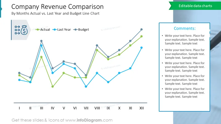
The slide is a graphical representation of a company's monthly revenue comparison over a year, plotting actual revenue against last year's figures and the budgeted projections. The line chart provides a clear month-by-month comparison, illustrating periods of overperformance or underperformance relative to the previous year and budget. This visual tool is crucial for financial analysis, enabling quick identification of trends, seasonal impacts, and the need for budgetary adjustments.
Overall, the slide has a streamlined and informative design, with color-coded lines making it easy to differentiate between the data sets for quick analysis.
Such a slide would be useful in:


