Your graphics add a nice touch to my presentations and I recently used them for one of my all-hands meetings. Your toolbox adds professionalism to my slides. Instead of using standard clipart.
Claude Jones, Director of Engineer, @Walmartlabs, USA
Your graphics add a nice touch to my presentations and I recently used them for one of my all-hands meetings. Your toolbox adds professionalism to my slides. Instead of using standard clipart.
Claude Jones, Director of Engineer, @Walmartlabs, USA
I needed a fresh look at some of my slides. I've tried to find a way to create a paintbrush effect, to underline, accentuate, add some color and the handwritten markers were just the things. Very easy to use, easy to size, change the color. It was an affordable, perfect solution and I'm happy to recommend it.
Anonymous, US
The crisp, clean look of the graphics, and the fact that it allowed me to easily edit and change the colors to match the template was my main reason for purchasing them.
Brandie Jenkins, E-learning Developer, USA
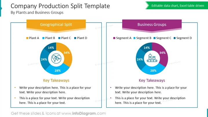
The PowerPoint slide titled "Company Production Split Template" illustrates a comparison of production distribution by two different categories: geographical location and business groups. Each category is represented by a donut chart, with "Geographical Split" showing the production percentages of plants A, B, C, and D, and "Business Groups" depicting segments A, B, C, and D. Beneath each chart, there are bullet points labeled "Key Takeaways," indicating that detailed insights or summaries can be written here to provide context to the data visualized in the charts.
The slide has a clean and balanced visual composition, facilitating an easy comparison between the two sets of data. The use of colors and icons helps to differentiate and highlight the distinct categories illustrated by the charts.


