Your graphics add a nice touch to my presentations and I recently used them for one of my all-hands meetings. Your toolbox adds professionalism to my slides. Instead of using standard clipart.
Claude Jones, Director of Engineer, @Walmartlabs, USA
Your graphics add a nice touch to my presentations and I recently used them for one of my all-hands meetings. Your toolbox adds professionalism to my slides. Instead of using standard clipart.
Claude Jones, Director of Engineer, @Walmartlabs, USA
I needed a fresh look at some of my slides. I've tried to find a way to create a paintbrush effect, to underline, accentuate, add some color and the handwritten markers were just the things. Very easy to use, easy to size, change the color. It was an affordable, perfect solution and I'm happy to recommend it.
Anonymous, US
The crisp, clean look of the graphics, and the fact that it allowed me to easily edit and change the colors to match the template was my main reason for purchasing them.
Brandie Jenkins, E-learning Developer, USA
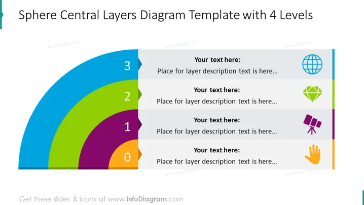
This slide depicts a Sphere Central Layers Diagram with 4 levels, represented by concentric arcs in different colors numbered from 0 to 3. Each arc is associated with a text box which says "Your text here: Place for layer description text is here..." interpreted as a placeholder for detailed information about that particular layer. Visually, the layers suggest a build-up or accumulation of aspects, steps, or components with increasing levels of importance, complexity, or progression.
The overall look is polished and well-organized, with color coding aiding in the visual connection between the diagram's components and their descriptions. The icons add a symbolic representation to each level of the diagram, potentially offering a mnemonic for the content.


