Your graphics add a nice touch to my presentations and I recently used them for one of my all-hands meetings. Your toolbox adds professionalism to my slides. Instead of using standard clipart.
Claude Jones, Director of Engineer, @Walmartlabs, USA
Your graphics add a nice touch to my presentations and I recently used them for one of my all-hands meetings. Your toolbox adds professionalism to my slides. Instead of using standard clipart.
Claude Jones, Director of Engineer, @Walmartlabs, USA
I needed a fresh look at some of my slides. I've tried to find a way to create a paintbrush effect, to underline, accentuate, add some color and the handwritten markers were just the things. Very easy to use, easy to size, change the color. It was an affordable, perfect solution and I'm happy to recommend it.
Anonymous, US
The crisp, clean look of the graphics, and the fact that it allowed me to easily edit and change the colors to match the template was my main reason for purchasing them.
Brandie Jenkins, E-learning Developer, USA
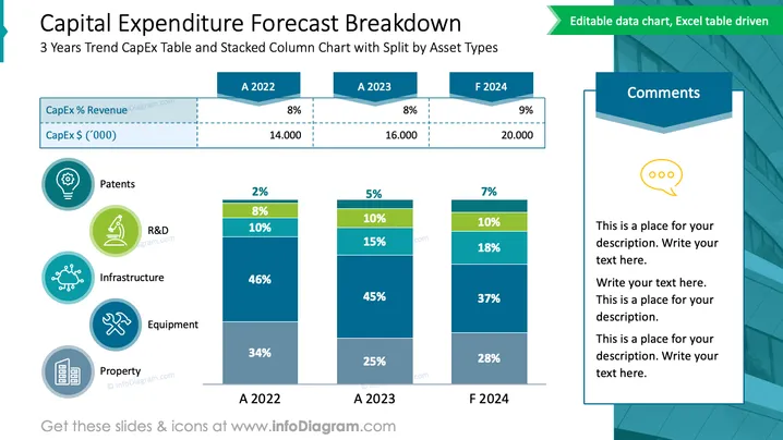
The slide presents a 3-year trend of Capital Expenditure (CapEx) with a stacked column chart breaking down expenses by asset types such as Patents, R&D, Infrastructure, Equipment, and Property. Percentages of revenue and total CapEx values in thousands are indicated for each year, showing a slight increase in spending forecasted for F 2024. The left side enumerates the different asset types with associated icons. A "Comments" section on the right suggests where additional context or explanations might be inserted.
The slide has a balanced composition, with graphical elements and text boxes evenly spaced out. The cool color palette gives it a corporate and analytical feel, and the mix of icons and charts facilitates an engaging data presentation.


