Your graphics add a nice touch to my presentations and I recently used them for one of my all-hands meetings. Your toolbox adds professionalism to my slides. Instead of using standard clipart.
Claude Jones, Director of Engineer, @Walmartlabs, USA
Your graphics add a nice touch to my presentations and I recently used them for one of my all-hands meetings. Your toolbox adds professionalism to my slides. Instead of using standard clipart.
Claude Jones, Director of Engineer, @Walmartlabs, USA
I needed a fresh look at some of my slides. I've tried to find a way to create a paintbrush effect, to underline, accentuate, add some color and the handwritten markers were just the things. Very easy to use, easy to size, change the color. It was an affordable, perfect solution and I'm happy to recommend it.
Anonymous, US
The crisp, clean look of the graphics, and the fact that it allowed me to easily edit and change the colors to match the template was my main reason for purchasing them.
Brandie Jenkins, E-learning Developer, USA
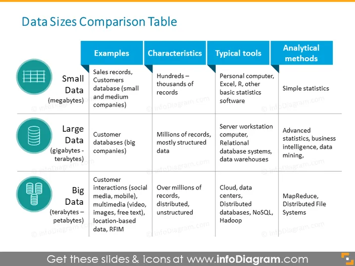
The slide titled "Data Sizes Comparison Table" provides a comparison between Small Data, Large Data, and Big Data. Small Data are in megabytes and include sales records and customer databases from small to medium companies, characterized by hundreds to thousands of records, typically analyzed using personal computers, Excel, or other basic statistics software through simple statistics. Large Data spans gigabytes to terabytes, consists of customer databases from big companies, has millions of structured records, and is handled using server workstation computers, relational database systems, and data warehouses, with analysis conducted through advanced statistics, business intelligence, and data mining. Big Data extends into petabytes, encompasses customer interactions across various platforms, possesses over millions of distributed, unstructured records, and is processed using cloud services, data centers, distributed databases, NoSQL, and Hadoop, analyzed by methods such as MapReduce and Distributed File Systems.
The overall design is modern and clean, with a good use of contrasting colors to distinguish between different types of data. Icons are used effectively to symbolize each category, enhancing visual communication.


