Your graphics add a nice touch to my presentations and I recently used them for one of my all-hands meetings. Your toolbox adds professionalism to my slides. Instead of using standard clipart.
Claude Jones, Director of Engineer, @Walmartlabs, USA
Your graphics add a nice touch to my presentations and I recently used them for one of my all-hands meetings. Your toolbox adds professionalism to my slides. Instead of using standard clipart.
Claude Jones, Director of Engineer, @Walmartlabs, USA
I needed a fresh look at some of my slides. I've tried to find a way to create a paintbrush effect, to underline, accentuate, add some color and the handwritten markers were just the things. Very easy to use, easy to size, change the color. It was an affordable, perfect solution and I'm happy to recommend it.
Anonymous, US
The crisp, clean look of the graphics, and the fact that it allowed me to easily edit and change the colors to match the template was my main reason for purchasing them.
Brandie Jenkins, E-learning Developer, USA
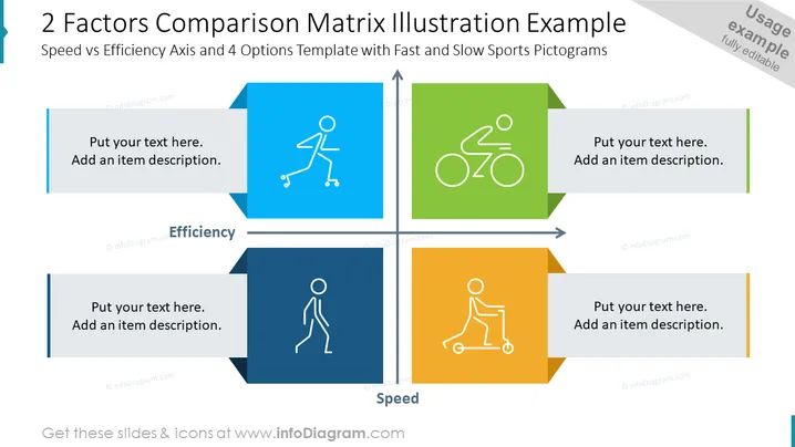
This PowerPoint slide is designed to compare four different options or items based on two factors: Speed and Efficiency. In the upper left quadrant, there is an icon that suggests a moderate speed and high efficiency, symbolized by a person on roller skates. The upper right quadrant shows a symbol for high speed and high efficiency – a person on a bicycle. In the bottom left, there is an icon representing low speed and low efficiency, depicted by a figure walking. Lastly, the bottom right shows a scooting figure, illustrating low efficiency and high speed. Each quadrant has a space to add text and further item descriptions.
The slide has a clean, professional design with color-coded quadrants that make it easy to differentiate the factors being compared. Pictograms and arrows effectively guide viewers to understand the axes of comparison.


