Your graphics add a nice touch to my presentations and I recently used them for one of my all-hands meetings. Your toolbox adds professionalism to my slides. Instead of using standard clipart.
Claude Jones, Director of Engineer, @Walmartlabs, USA
Your graphics add a nice touch to my presentations and I recently used them for one of my all-hands meetings. Your toolbox adds professionalism to my slides. Instead of using standard clipart.
Claude Jones, Director of Engineer, @Walmartlabs, USA
I needed a fresh look at some of my slides. I've tried to find a way to create a paintbrush effect, to underline, accentuate, add some color and the handwritten markers were just the things. Very easy to use, easy to size, change the color. It was an affordable, perfect solution and I'm happy to recommend it.
Anonymous, US
The crisp, clean look of the graphics, and the fact that it allowed me to easily edit and change the colors to match the template was my main reason for purchasing them.
Brandie Jenkins, E-learning Developer, USA
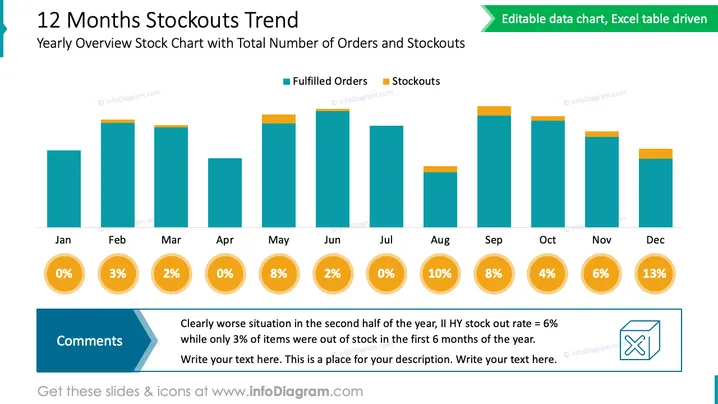
The PowerPoint slide depicts a "12 Months Stockouts Trend," highlighting a Yearly Overview Stock Chart with Total Number of Orders and Stockouts. The bar graph contrasts fulfilled orders (in teal) with stockouts (in orange) across the year, from January to December. Percentages below each month indicate the stockouts rate, visually informing about inventory management effectiveness. A "Comments" section at the bottom left corner indicates a notable worsening in the second half of the year based on these rates, with a call to action to review the data in more detail or add more context.
The overall look of the slide is clean and businesslike, using a color-coded bar chart for easy interpretation of the data. It allows for a at-a-glance understanding of the trend and issues with stock over the course of a year.


